library(ggsem)
ggsem()1 A Quick Overview on Multi-Group SEM Workflow
This chapter is for users who are already familiar with standard SEM methods in R using the lavaan package to demonstrate how ggsem can expand the existing workflow significantly.
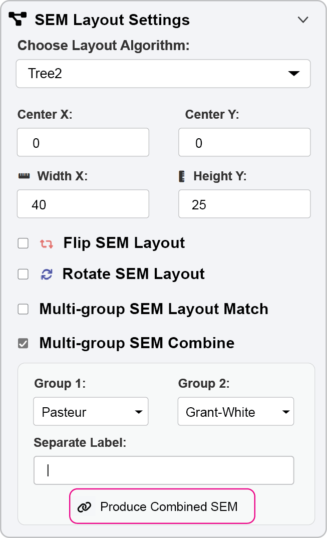
Here, I will show you a quick workflow of visualizing a multi-group SEM diagram in two principal types (side-by-side composite figure or combined SEM). The ggsem app can be launched by ggsem() code, opening up a blank canvas where users can draw diagrams (see next chapter).
Instead of opening the app in blank canvas, ggsem app can also be launched by loading pre-existing objects, such as multi-group SEM lavaan objects (or other types), using the pipe operator |> or %>%. This will launch the app with pre-drawn diagrams.
library(tidyverse)
library(ggsem)
library(lavaan)
lavaan_string <- "visual  =~ x1 + x2 + x3
textual =~ x4 + x5 + x6
speed   =~ x7 + x8 + x9"

(fit <- sem(lavaan_string, data = HolzingerSwineford1939, group = 'school'))
lavaan 0.6-19 ended normally after 57 iterations
Estimator ML
Optimization method NLMINB
Number of model parameters 60
Number of observations per group:
Pasteur 156
Grant-White 145
Model Test User Model:
Test statistic 115.851
Degrees of freedom 48
P-value (Chi-square) 0.000
Test statistic for each group:
Pasteur 64.309
Grant-White 51.542fit is a fitted lavaan object containing the results of a multi-group SEM. The model, specified by lavaan_string, is estimated separately for each level of the school grouping variable in the HolzingerSwineford1939 dataset, allowing for the examination of measurement or structural invariance across the two schools.
ggsem_builder() |>
  add_group(name = "Pasteur", object = fit, x = -35) |>
  add_group(name ="Grant-White", object = fit, x = 35) |>
  launch()
ggsem_builder() sets up the object, and you can add_group() using the same multi-group lavaan object. You can define the name of each group to be identical to the group name in the data. Then, launch() the app with pre-loaded model objects.
1. ggsem_builder() - Initialization
ggsem_builder()Initiates
ggsempipe builder workflow.At this stage, the plot is essentially a blank slate waiting for SEM elements
2. add_group() - Multi-group Model Integration
|> add_group(name = "Pasteur", object = fit, x = -35)name = "Pasteur": Matches one of the group names from your originallavaanmodel (lavInspect(fit, "group.label"))object = fit: The fitted multi-group SEM object containing all parameter estimates and model specificationsx = -35: Positions this group’s diagram 35 units to the left of center for clear visual separation
What happens internally:
Extracts the model specification and parameter estimates for the “Pasteur” group from the
fitobjectAutomatically draws all latent variables, observed variables, factor loadings, etc
Applies consistent styling and layout algorithms
Positions the entire sub-model at the specified x-coordinate
3. Second add_group() - Parallel Group Addition
|> add_group(name = "Grant-White", object = fit, x = 35)Repeats the same extraction process for the second school group
Positions this diagram 35 units to the right of center
Maintains identical visual styling and scaling for direct comparison
The x-positioning (
-35vs+35) creates a side-by-side comparison layout
4. launch() - Interactive Application Launch
|> launch()Opens the Shiny-based interactive application
Crucially: Instead of a blank canvas, the app opens with both group diagrams pre-rendered and positioned
All the SEM elements are already drawn with their correct relationships
The user can immediately begin modifying, exploring, or customizing rather than building from scratch
1.1 Figure Outputs
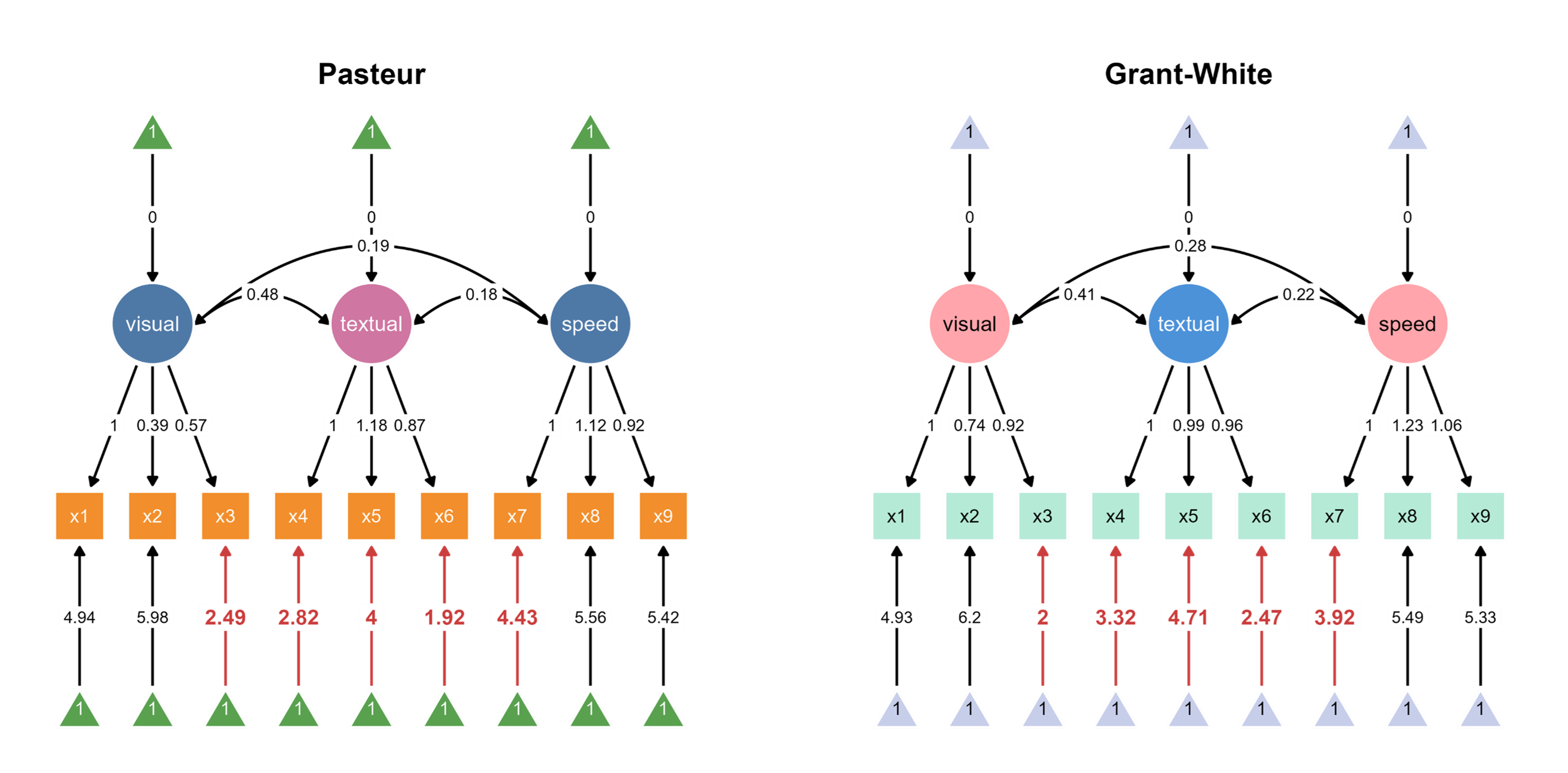
The code above automatically loads two SEM diagrams into the canvas, where you can assign unique color palettes in the app.
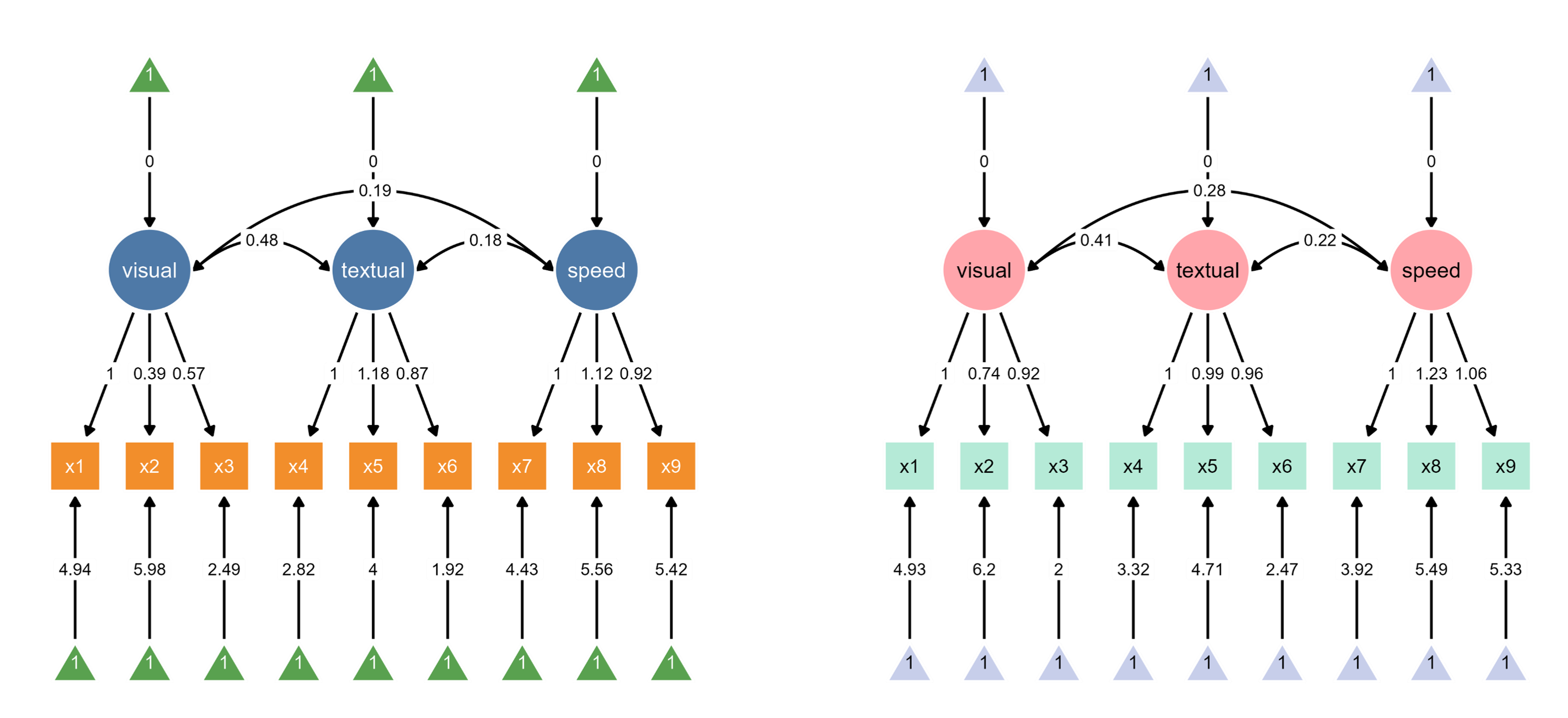
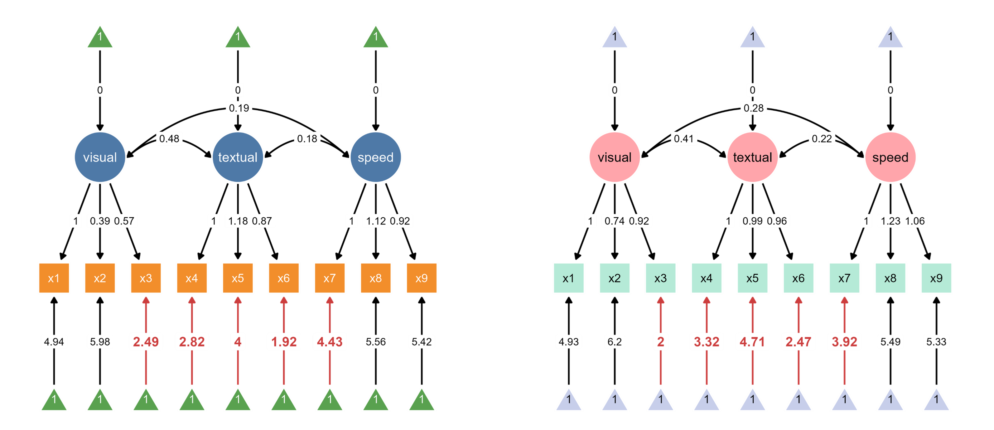
Since ggsem directly has access to the model statistics, it can also highlight paths that are significantly different between two groups (schools).
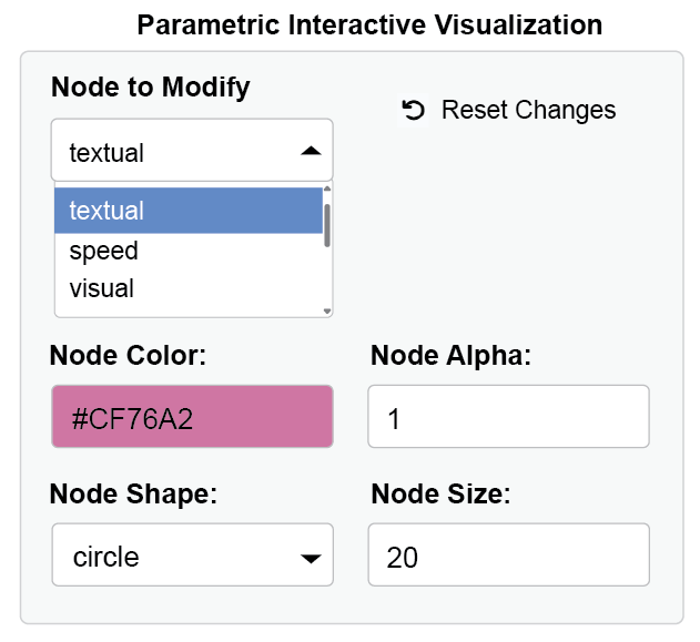
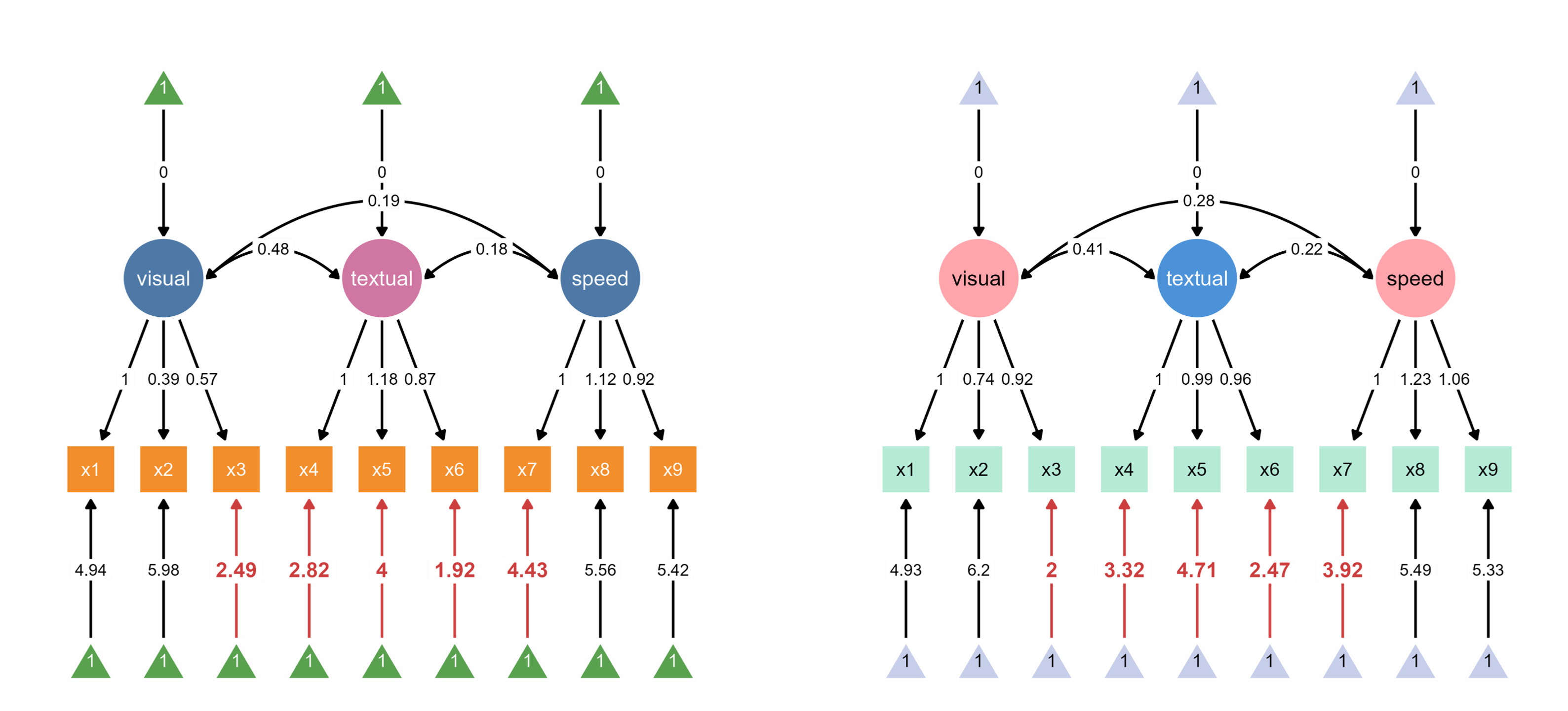
Through interactive parameter visualization, you can change any visual aspects while keeping the model intact. Here, the aesthetics of the textual node have been modified.
Finally, group labels can automatically be added based on the groups’ name introduced in add_group().
You can also combine the two SEM diagrams into one diagram, and align edge labels side-by-side.
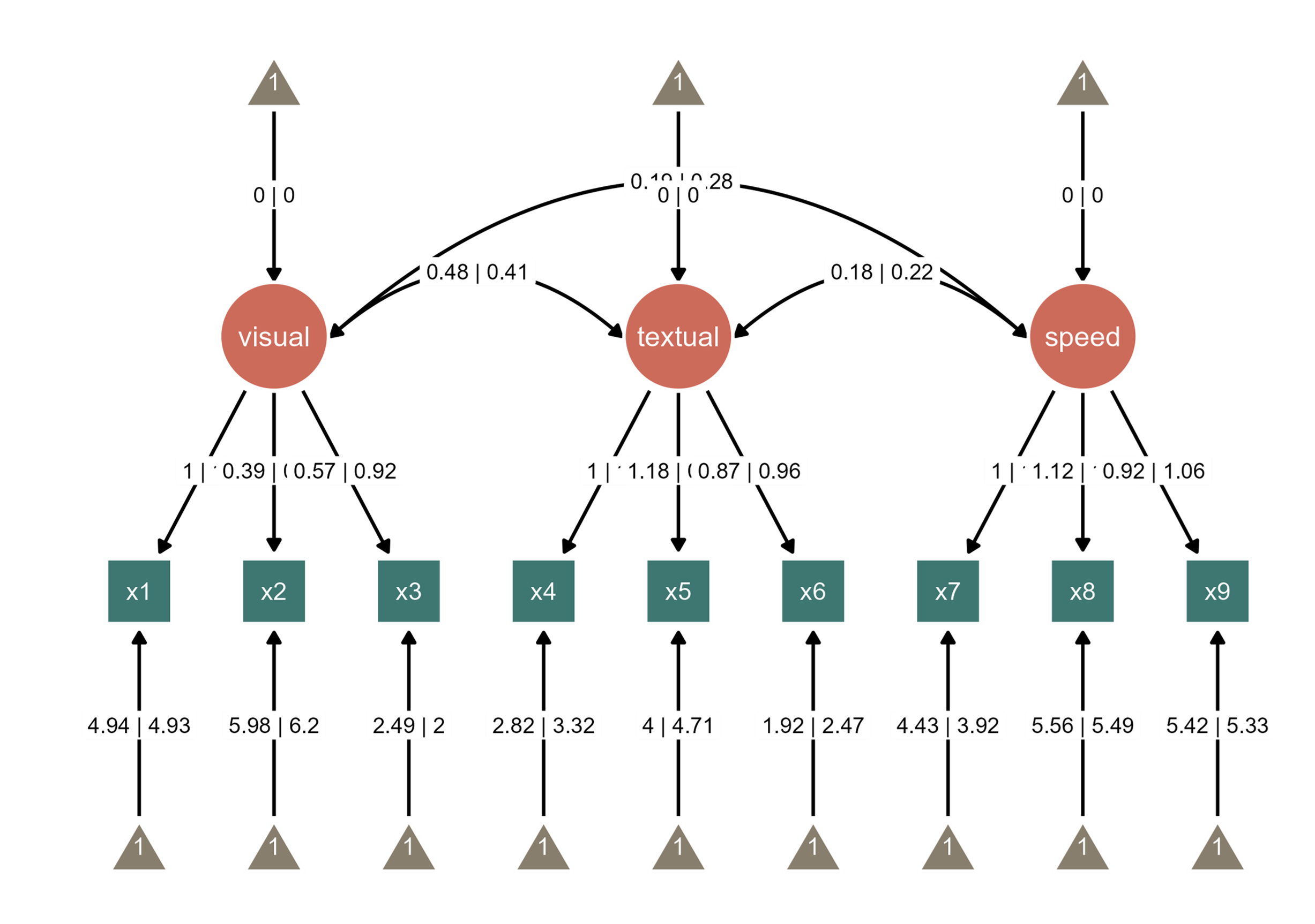
Notice that the edge label of the path between visual and speed nodes overlap with the edge label between textual node and its intercept. So we can increase the curvature of the curved line. The path is colored in blue to highlight the change. These are achieved via interactive parameter visualization.
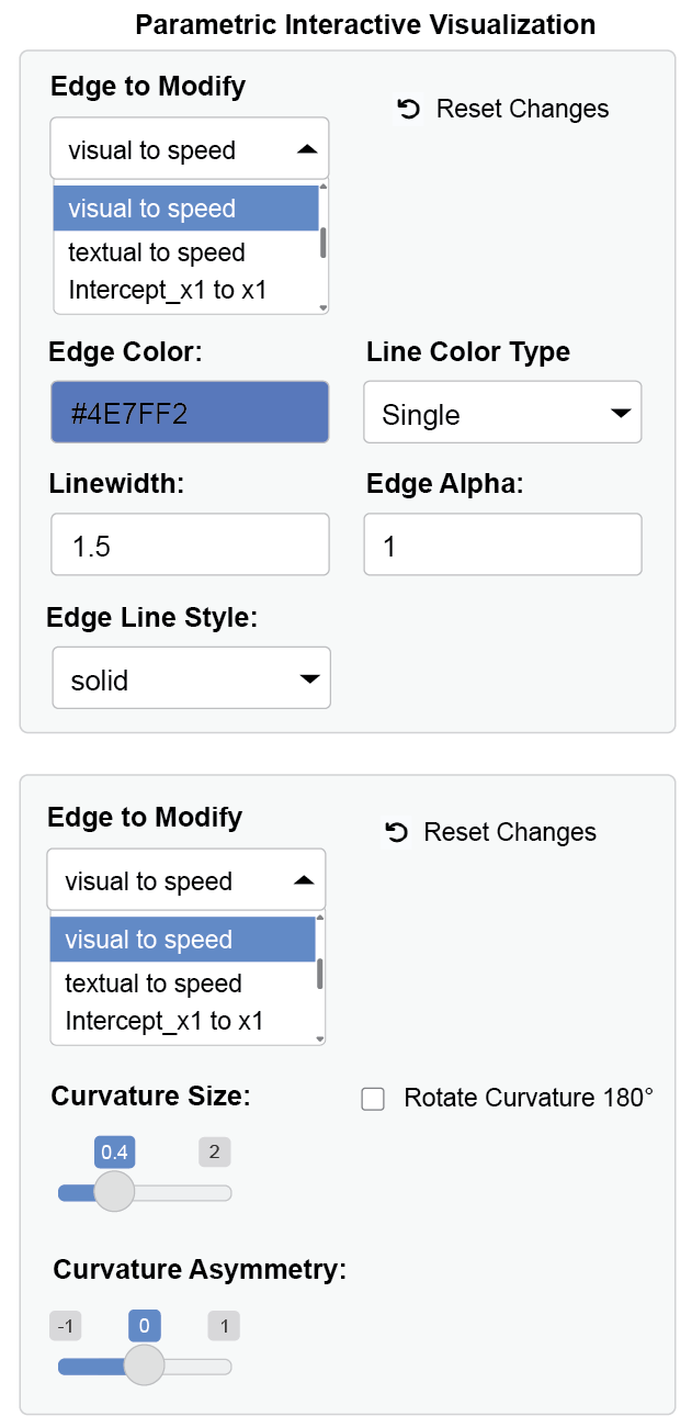
visual and speed nodes through a dynamic dropdown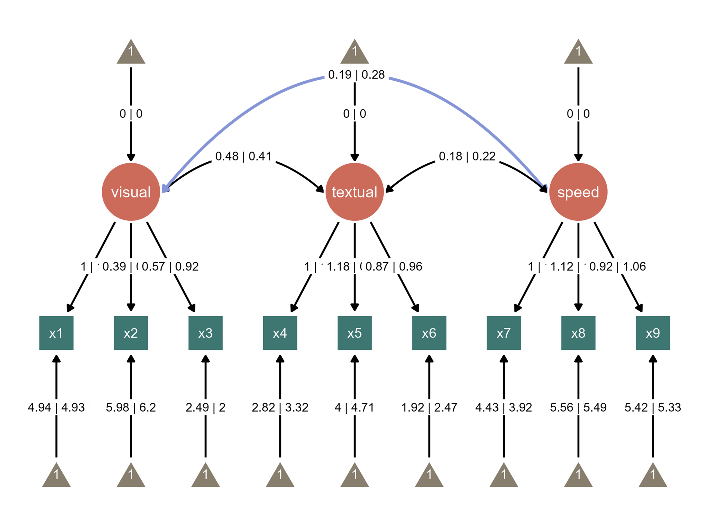
You can replay this workflow using undo and redo buttons in the app menu by loading the metadata (that I have created from this session) that app produces.
ggsem() # run the app and load the metadata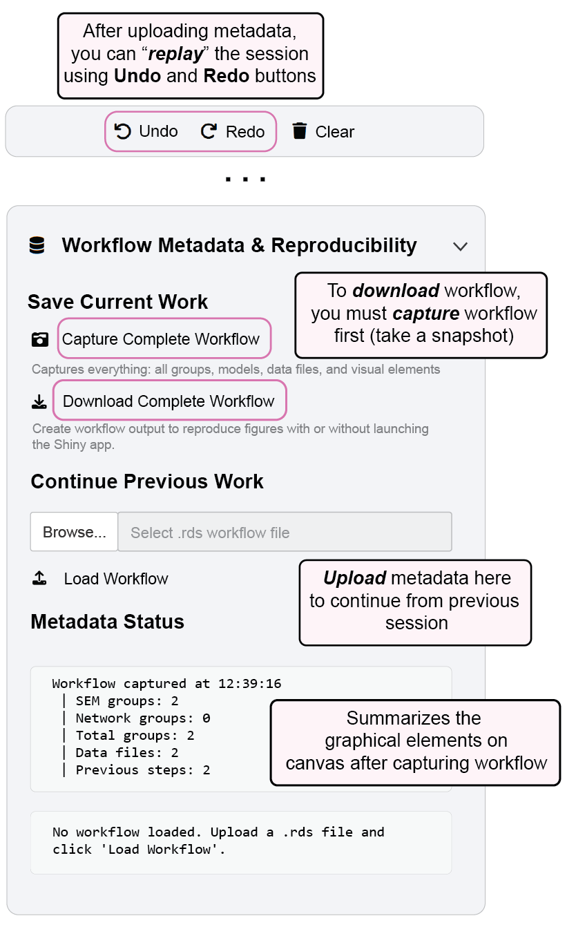
To reproduce Figure 5, you can download the metadata from online, and load it in the app.
www.smin95.com/fig5.rdsThis image can also be loaded in script-based workflow using these codes below into a ggplot output directly using the metadata (more information in Chapter 17).
library(tidyverse)
library(ggsem)

metadata_fig5 <- readRDS('fig5.rds') # load the metadata from your directory
fig5 <- metadata_to_ggplot(metadata_fig5) # convert the metadata to a ggplot objectsave_figure('fig5.png', fig5)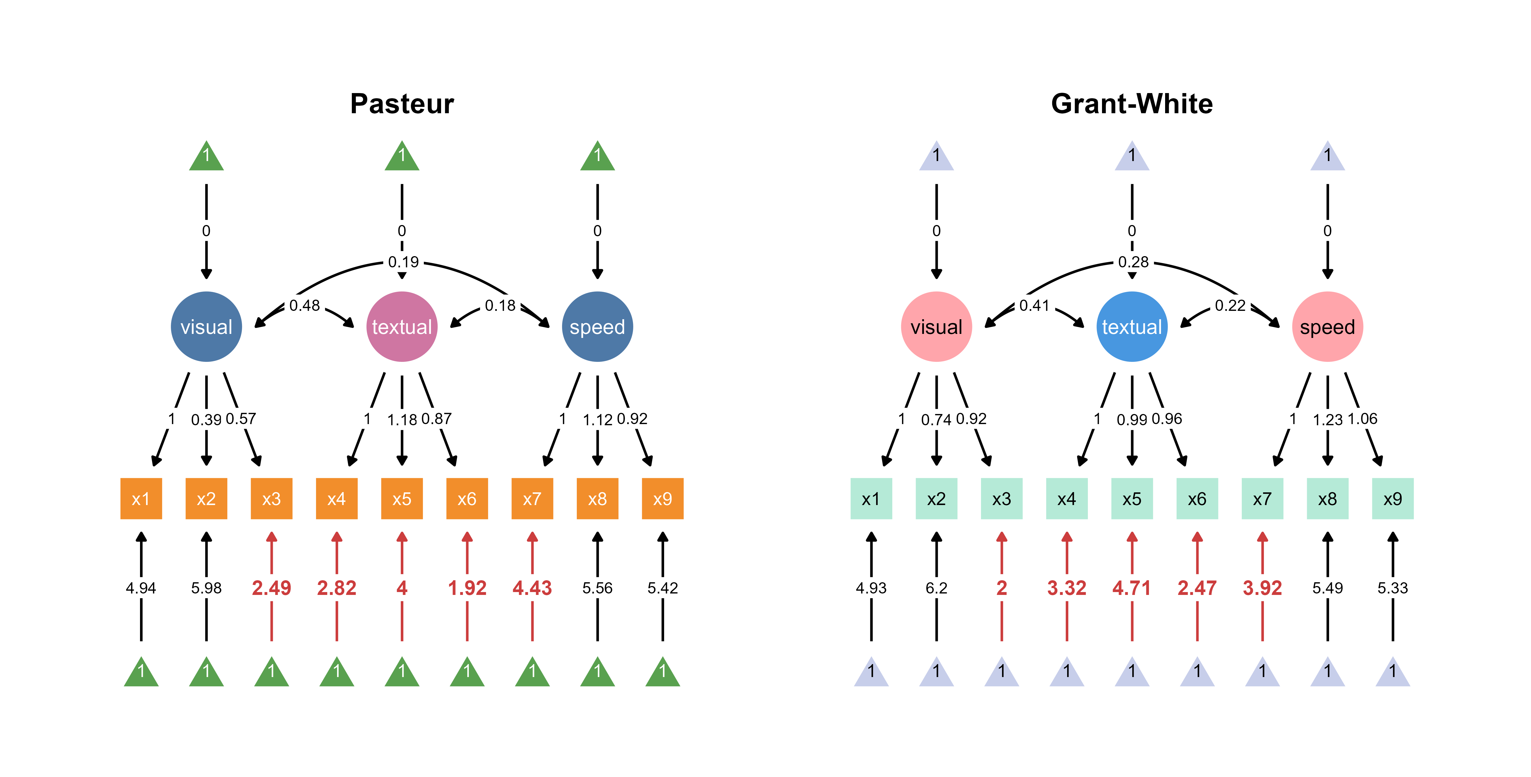
If this workflow interests you, please continue to read the book. The next chapter describes the ggsem app in general, which is straightforward to use.