library(ggsem)
ggsem()3 Batch Graphical Functions
Visualizations created without raw data are valuable for education and theory-building. While generic design software can create such figures, they lack reproducibility. The ggsem app solves this by letting you efficiently create complex diagrams through automated layout and batch editing, rather than placing each element individually.
Building on the example from the previous chapter, we will explore more features of ggsem on its auto-generation functions, which have been designed to reduce the number of potential clicks users need to make to generate multiple graphical components.
3.1 Generate Graphics
In this section, we will generate graphical elements in batch using lock/unlock system in the app. First, launch the application locally.
3.1.1 Points
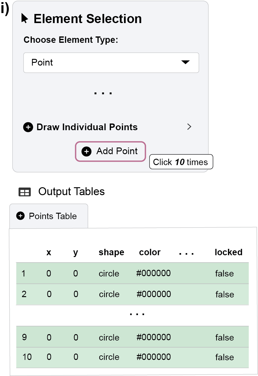
First, we will start by creating a foundation of points:
Click the Add Point button ten times to generate ten individual points.
- You can confirm this in the Points Table below the plot, which should show ten rows. The green background in the rows from the table indicates these points are “unlocked,” meaning they can be modified as a group.
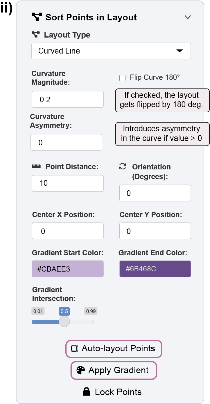
Figure 2. First part of the example: arrange the position and color of the 10 points. To arrange these points automatically, open the “Sort Points in Layout” panel.
From the Layout Type dropdown, select “Curved Line” and click the Auto-layout Points button.
The points will reorganize into a curved path.
You can fine-tune the curve’s shape and the spacing between points using the Curvature Magnitude and Point Distance inputs.
Next, let’s apply a color gradient. Set the Gradient Start Color to
#CBAEE3(light purple) and the Gradient End Color to#6B468C(dark purple). Click the Apply Gradient button to distribute these colors across the unlocked points.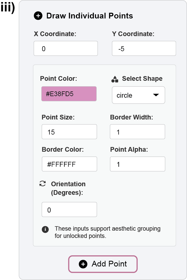
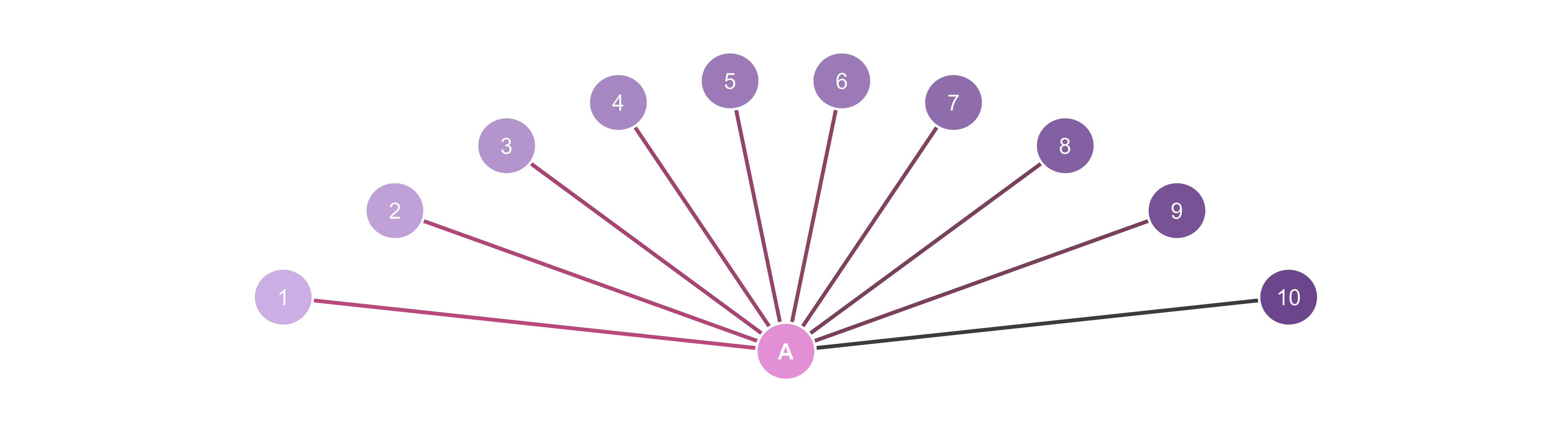
Figure 3. First part of the example: add 11th point in the center of the layout. Finally, we’ll add a central point. In the “Draw Individual Points” panel, set the X Coordinate to
0, Y Coordinate to-5, and choose a color like#E38FD5(pink). Click Add Point to place it.
3.1.2 Lines
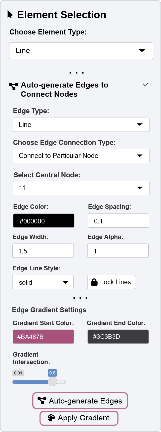
Now, we can automatically generate lines (edges) to connect our unlocked points. In this case, we will connect the central pink point to all the points in the purple curved line.
- Open the “Auto-generate Edges to Connect Nodes” panel.
- From the Choose Edge Connection Type dropdown, select “Connect to Particular Node”. This will reveal a new dropdown, “Select Central Node,” which lists all unlocked points. Select the point you just added (it will be the 11th point).
- Set the Edge Spacing to
0.1(this controls the gap between the line and the point’s border) and the Edge Width to1.5. - Click the Auto-generate Edges button to draw the connecting lines.
To color these lines with a gradient, use the controls in the same panel:
- Set the Gradient Start Color to
#BA487B(pink) and the Gradient End Color to#3C3B3D(dark gray). - To make the pink more dominant, adjust the Gradient Intersection slider to
0.8(a value closer to 1 gives more weight to the start color). Click Apply Gradient to update the lines.
3.1.3 Text Annotations
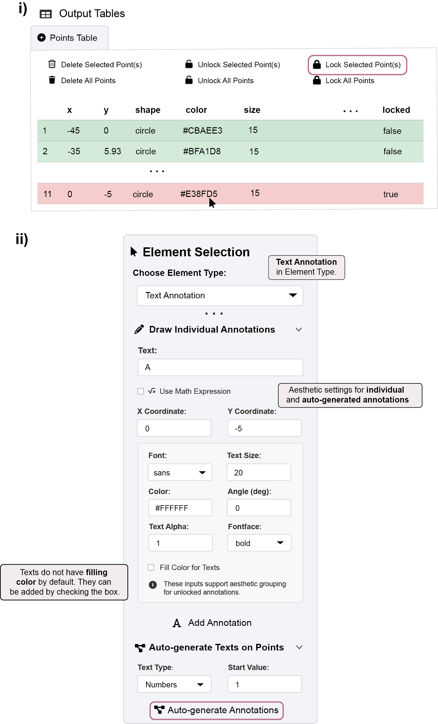
Finally, we will label the points. We want to number the purple points but not the central pink one.
- To prevent the pink point from being annotated, find its row in the Points Table, select it, and click the Lock Selected Point(s) button.
- Locking it ensures it won’t be affected by auto-generation functions.
- Open the “Auto-generate Texts on Points” panel. Ensure the Text Color is set to
#FFFFFF(white) and click the Auto-generate Annotations button.- This will label all the unlocked (purple) points with sequential numbers, starting from
1.
- This will label all the unlocked (purple) points with sequential numbers, starting from
- To add a custom label to the locked pink point, use the “Draw Individual Annotations” panel. Set the Color to
#FFFFFF(white), the Fontface tobold, and enterA. - Click Add Annotation to place the custom text label.
We have now automatically generated and customized points, lines, and text annotations using the lock/unlock system to control which elements are modified. The same principles apply to creating and styling self-loop arrows and applying gradients to them.
3.1.4 Save the image output
- Double-check if the Fixed Aspect Ratio box is unchecked.
- Do not provide any specific x or y ranges. Then the app will automatically determine the appropriate range.
- Save the image in PNG file.
Here’s the image output saved in PNG format.
3.2 Reproduce the Graphics Outside the App
Follow these steps to render your ggsem creation directly in R:
Load the package: Start by loading the ggsem library into your R session.
Import Data: Read your saved CSV files (
points.csv,lines.csv,annotations.csv) from your directory, storing them as separate objects (e.g.,points,lines,annotations).Combine: Create a single list (e.g.,
ggsem_data) containing these three data frames.Generate Plot: Pass this list to the
csv_to_ggplot()function. It will convert the data into a ggplot object and automatically set the axis limits, just as the app does when you export an image.Export: Save the plot object (e.g.,
plot3) usingsave_figure(). There is no need to specifywidthorheight, as the function determines these automatically to maintain the correct aspect ratio and prevent a distorted figure.
library(ggsem)Registered S3 method overwritten by 'tidySEM':
method from
predict.MxModel OpenMxDocumentation website of ggsem: smin95.github.io/ggsem/points <- read.csv('batch/points_batch.csv')
lines <- read.csv('batch/lines_batch.csv')
annotations <- read.csv('batch/annotations_batch.csv')
ggsem_data <- list(points, lines, annotations) # Put them in a list, any order is fineplot3 <- csv_to_ggplot(ggsem_data)Coordinate system already present.
ℹ Adding new coordinate system, which will replace the existing one.save_figure('plot3.png', plot3)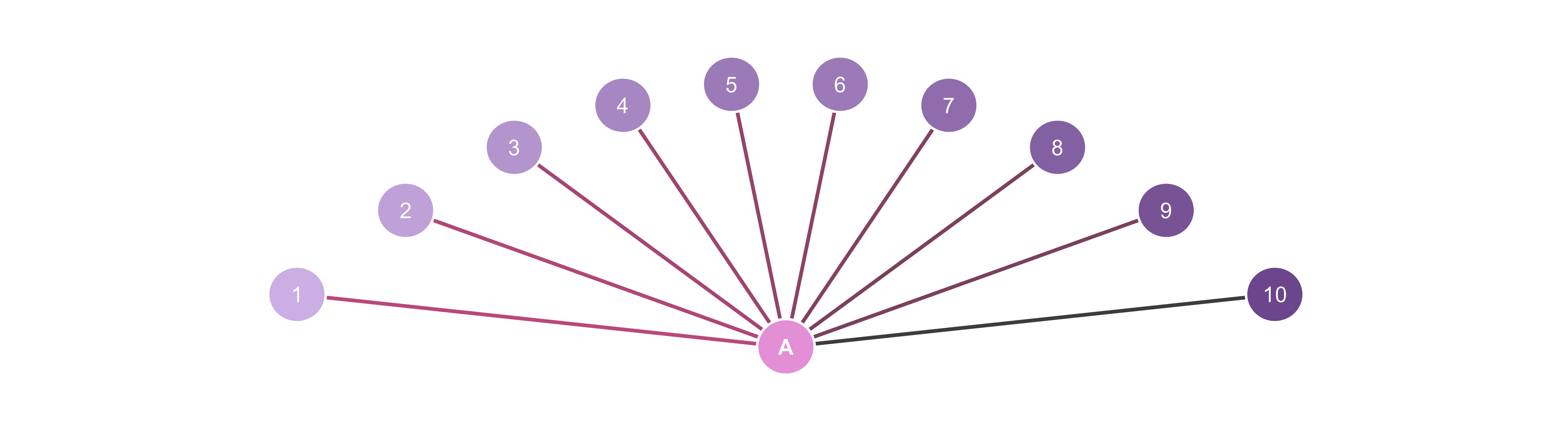
You can control the amount of empty white space by either reducing or increasing it using the function adjust_axis_space(). It provides fine-grained control over the plot’s margins, letting you crop each side by a specific percentage. The main arguments are:
x_adjust_left_percent: Shrinks the left-side x-axis boundary.x_adjust_right_percent: Shrinks the right-side x-axis boundary.y_adjust_bottom_percent: Shrinks the bottom y-axis boundary.y_adjust_top_percent: Shrinks the top y-axis boundary.
There is some additional white space on the x-axis in plot3. So, we will remove 17% of the space from both the left and right sides of the x-axis range. Save this modified object using save_figure() as an image file named plot3b.png.
plot3b <- adjust_axis_space(plot3, x_adjust_right_percent = -17, x_adjust_left_percent = -17)save_figure('plot3b.png', plot3b)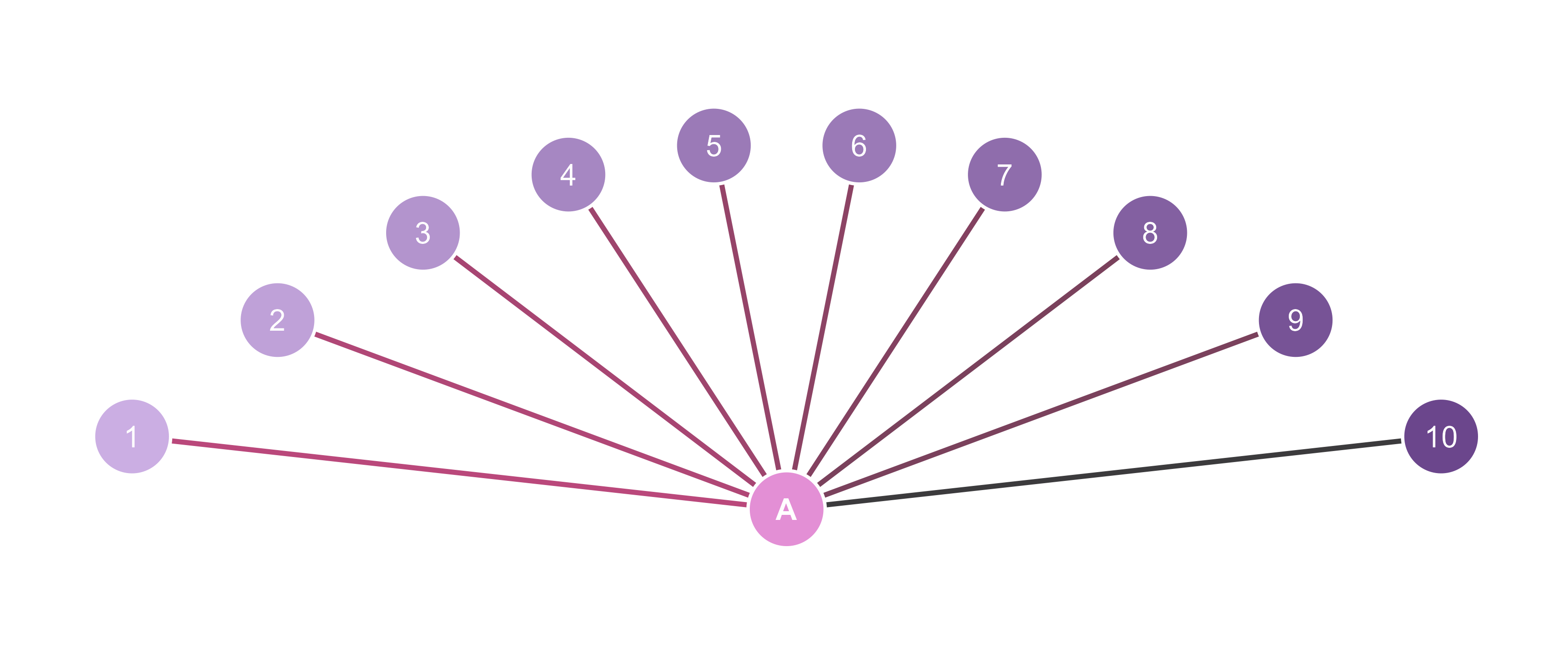
3.3 Summary
In summary, by creating a set of unlocked points, we were able to automatically generate edges and annotations with minimal effort. This demonstrates the efficiency of ggsem’s lock/unlock system, which allows for batch editing of specific elements. This workflow empowers users to efficiently build complex diagrams, such as networks and SEMs, for educational or illustrative purposes.