3. Drawing Structural Equation Modeling Diagrams Without Data
Source:vignettes/lavaan.Rmd
lavaan.RmdIn this chapter, we will visualize structural equation modeling (SEM) diagrams.
The lavaan Package’s Syntax
In psychology, the lavaan package has been widely used for structural equation modeling (SEM) in R. It integrates methods such as factor analysis, regression models and path analysis into a coherent framework, allowing researchers to study how different variables are related to one another. Basically, models can be specified using strings in a particular syntax of the lavaan package in the ggsem application.
# Latent variable definitions
# Copy and paste it into ggsem app without quotations

reading =~ x1 + x2 + x3
math =~ x4 + x5 + x6
music =~ x7 + x8 + x9

music ~~ math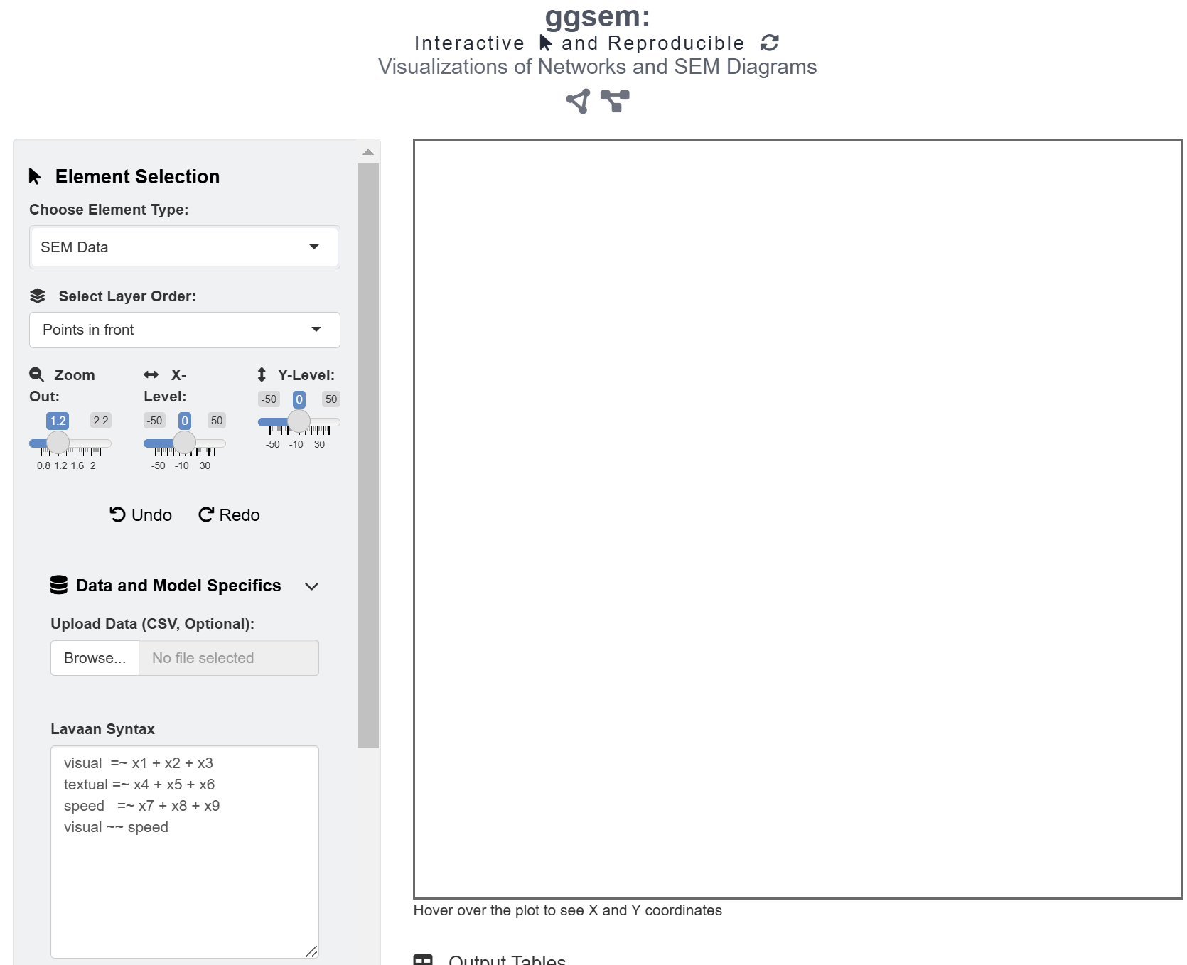
In this example, there are three latent variables
(reading, math and music) and
nine observed variables (x1 to x9). A latent
variable can be inferred from a set of data from other variables but not
directly observed. Usually, it captures an index that cannot easily be
measured or quantified.
The string =~ is a syntax from lavaan,
often used to define the relationship between latent and observed
variables. It can be translated as “is measured by” or “is indicated
by”. For instance, music =~ x7 + x8 + x9 means that the
latent variable music can be measured with the three
variables x7, x8, x9, such as the
sense of rhythm, reading ability in music scores, and aptitude in
learning to play a musical instrument. In other words, the
=~operator in lavaan denotes a one-way
direction. By convention, such as in the semPlot
package, a one-way arrow drawn from the latent variable to the observed
variable
Therefore, to translate the strings above, reading can
be measured by x1, x2 and x3
variables (ex. language), math can be measured by
x4, x5 and x6 variables, and
music can be measured by x7, x8
and x9 variables.
Additionally, the ~ operator indicates a causal
relationship from the independent variable to the dependent variable. It
is also a one-way relationship. For instance, if one’s stamina is very
high, then one’s running distance will be much longer.
Both ~ (regression) and =~ are shown as a
one-way arrow in SEM diagrams, and these are recognized by the
ggsem app in similar fashion as that in
semPlot.
‘~~’ refers to covariance, and ggsem plots it as a two-way arrow (curved rather than straight) just like in semPlot (curved).
Drawing a SEM diagram with a lavaan model
Let’s run the app locally using the code below (or online: https://smin95.shinyapps.io/ggsem/):
ggsem::ggsem()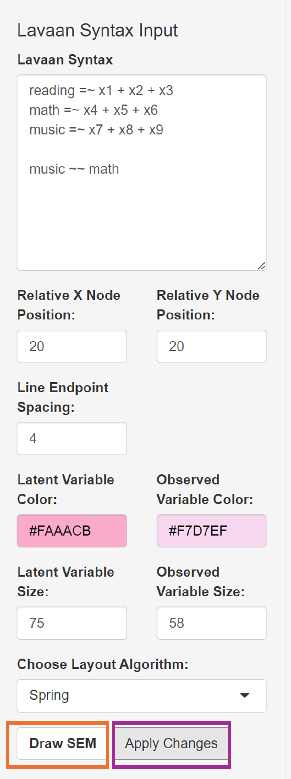
We can start by visualizing the SEM diagram using the strings:
# latent variable definitions
reading =~ x1 + x2 + x3
math =~ x4 + x5 + x6
music =~ x7 + x8 + x9

music ~~ math
This string is already written down in the text area of Lavaan Syntax under the SEM Data menu. If readers want to supply their own models, then delete this sample string. Here are some important inputs for drawing a SEM diagram from a lavaan model.
Center X: Horizontal center position of the SEM diagram.
Center Y: Vertical center position of the SEM diagram.
Width X: Radius of the SEM’s diagram width. If this is set to 15, then the entire width will be 30.
Height Y: Radius of the SEM’s diagram height. If this is set to 15, then the entire height will be 30.
Line Endpoint Spacing: Spacing between a node and a edge’s endpoint.
Arrowhead Location: Location of arrowhead (from latent to observed variable or from observed to latent variable).
Latent Variable Color: Color of the nodes that represent latent variables.
Observed Variable Color: Color of the nodes that represent observed variables.
Latent Variable Size: The size of the nodes that represent latent variables.
Observed Variable Size: The size of the nodes that represent observed variables.
Choose Layout Algorithms: Layout of the nodes and edges. The layouts are from the semPlot package. These include Tree, Circle, Spring, Tree2, Circle2 and Default.
We will adjust these inputs as (and leave the rest unchanged):
Width X: 20
Height Y: 20
Line Endpoint Spacing: 4
Latent Variable Color: #FAAACB
Observed Variable Color: #F7D7EF
Latent Variable Size: 25
Observed Variable Size: 18
Choose Layout Algorithms: Spring
After specifying the aesthetics, click the Draw SEM button (in the blue box), which creates new graphical outputs.
The Apply Changes button (in the pink box) modifies the aesthetics of the existing graphical outputs that have been created from the SEM Data menu.
The Apply Changes button modifies the aesthetics of graphical elements that have been created from the SEM Data menu but not from other menus. Components generated through lavaan have TRUE in the lavaan column in the output tables.
The Lock SEM Changes button (in the brown box) causes lavaan components to have FALSE in the lavaan column, making them immune to Apply Changes. Click it if you are satisfied with the aesthetics.
Modifying the SEM Diagram from ggsem app in ggplot2 Workflow
library(tidyverse)
library(ggsem)

# CSV files from ggsem app
points_data <- read_csv("https://www.smin95.com/sem_points.csv")
lines_data <- read_csv("https://www.smin95.com/sem_lines.csv")
texts_data <- read_csv("https://www.smin95.com/sem_annotations.csv")

sem_plot <- csv_to_ggplot(
  points_data = points_data,
  lines_data = lines_data,
  annotations_data = texts_data,
  element_order = c("lines", "points", "annotations")
) # order priority: lines < points < texts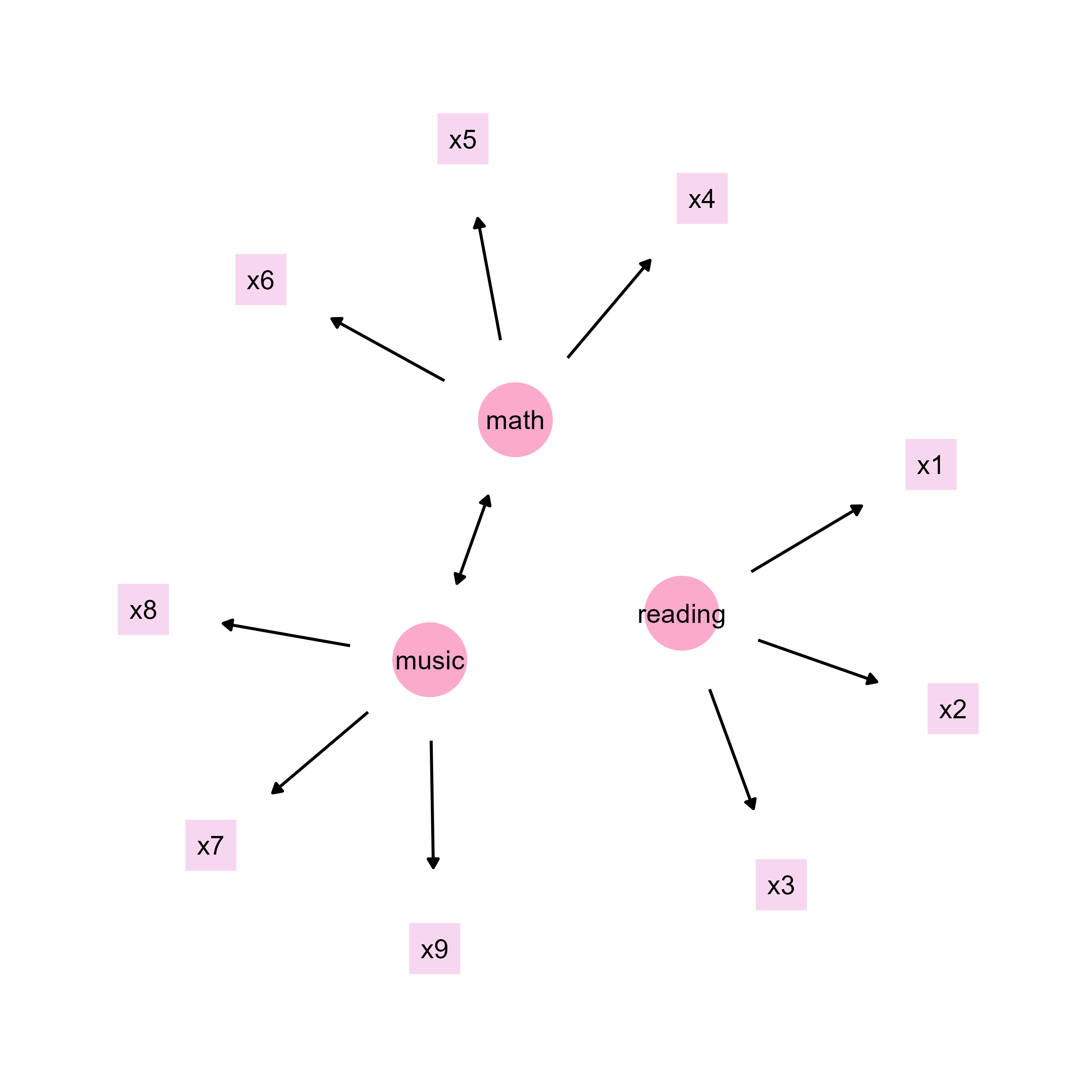
Next, we can remove some empty space by shrinking the range of the
axes using adjust_axis_space() by 17% at the top and 20% at
other places (to leave space for a title at the top).
sem_plot2 <- adjust_axis_space(sem_plot, x_adjust_left_percent = -20,
                               x_adjust_right_percent = -20,
                               y_adjust_bottom_percent = -20,
                               y_adjust_top_percent = -17)
Now, we can add title using the function annotate(),
which does not disrupt the scaling of the figure (ggtitle()
can be unpredictable). To do so, we first see the limits of the x and y
axis ranges to decide where we should annotate.
get_axis_range(sem_plot2)
#> $x_range
#> [1] -31.68  31.68
#>
#> $y_range
#> [1] -31.824  34.704
sem_plot2b <- sem_plot2 +
  annotate("text",
    label = "Intelligence Measure (SEM)", x = 0, y = 30, size = 7,
    fontface = "bold"
  )
save_figure("sem_plot2b.png", sem_plot2b)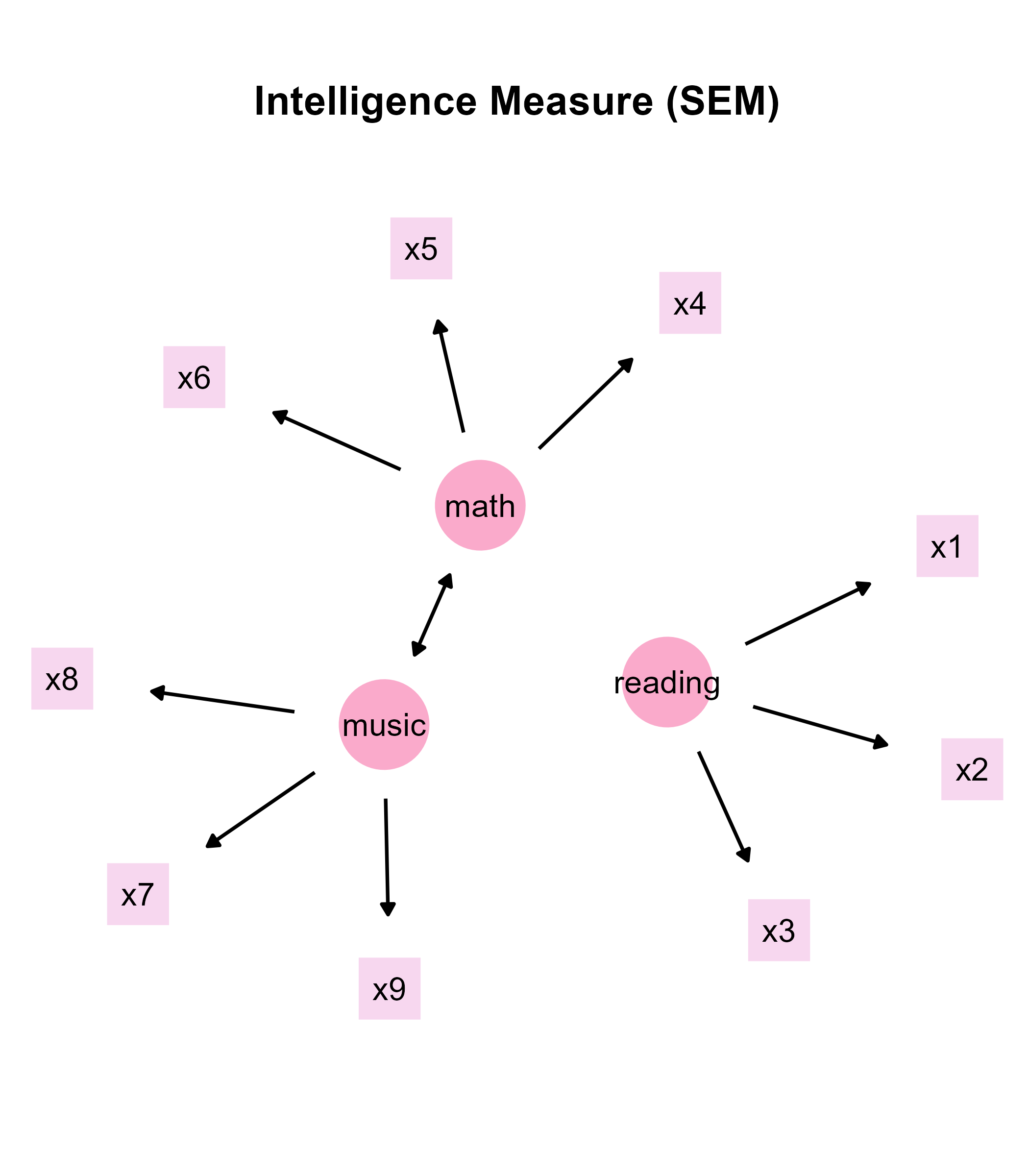
Hacking the CSV Outputs from ggsem app
You can also modify the CSV outputs before converting them into a
ggplot object. Notice that font of the texts in the SEM diagram
is too faint, so we can bold it by directly replacing the
values in the fontface column of
texts_data
texts_data$fontface <- "bold"Then, we can recreate the figure again using
csv_to_ggplot(), then save the output using
save_figure().
sem_plot3 <- csv_to_ggplot(
  points_data = points_data,
  lines_data = lines_data,
  annotations_data = texts_data,
  element_order = c("lines", "points", "annotations")
)

sem_plot3b <- adjust_axis_space(sem_plot3, x_adjust_left_percent = -20,
                               x_adjust_right_percent = -20,
                               y_adjust_bottom_percent = -20,
                               y_adjust_top_percent = -17)
sem_plot3c <- sem_plot3b +
  annotate("text",
    label = "Intelligence Measure (SEM)", x = 0, y = 30, size = 7,
    fontface = "bold"
  )
save_figure("sem_plot3c.png", sem_plot3c)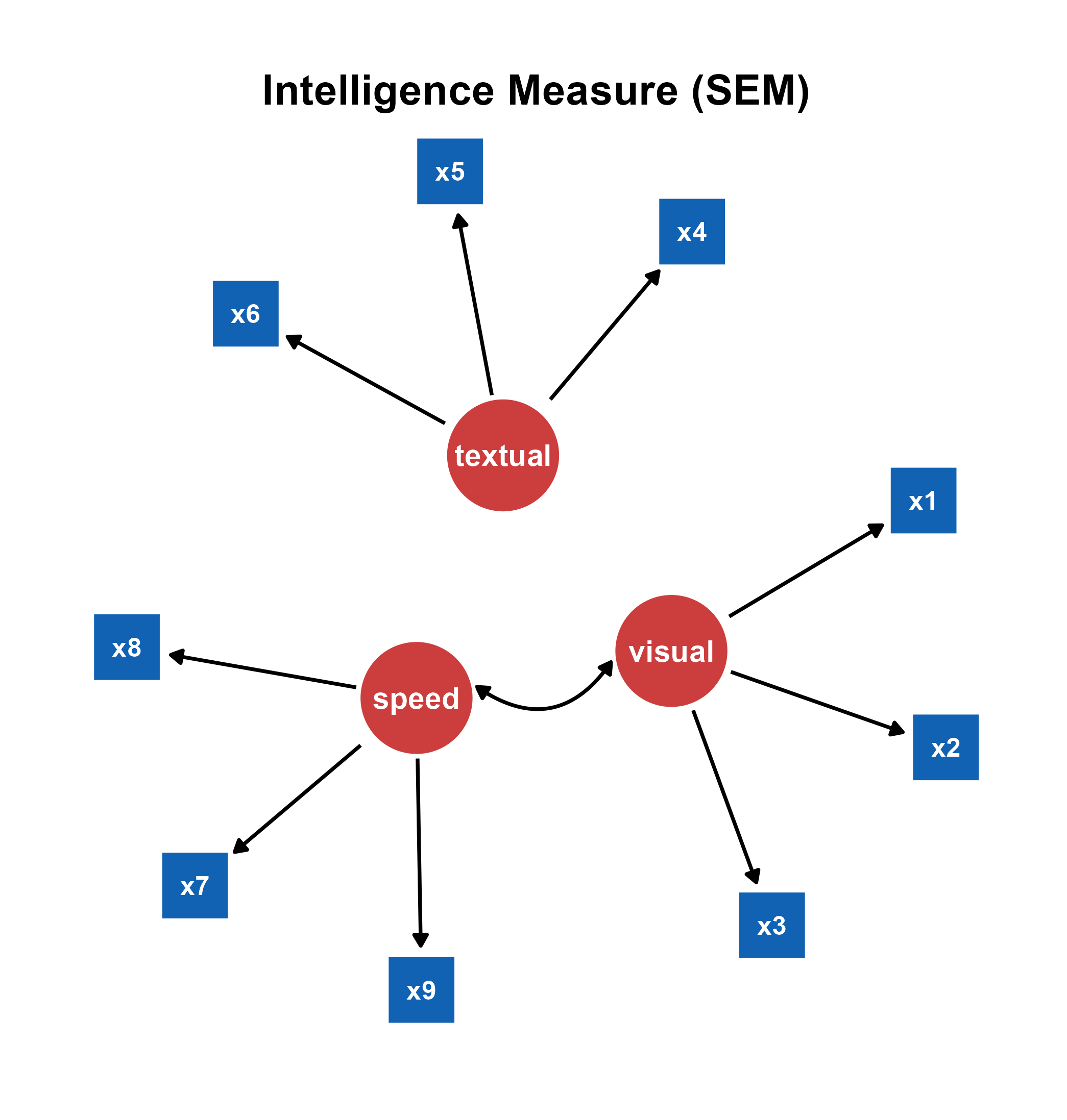
In summary, the outputs from the ggsem app can be directly modified using a ggplot2 workflow, making each and every graphical element computationally reproducible. I personally prefer to get the general diagram out of the way using the app, and then modify the details using ggplot2 directly, as I have demonstrated above. But this might differ among different users.