Launching the app
To begin with, let’s run the app locally using the code below (or online: https://smin95.shinyapps.io/ggsem/):
install.packages("devtools")
devtools::install_github("smin95/ggsem")

ggsem::ggsem()
The app’s layout
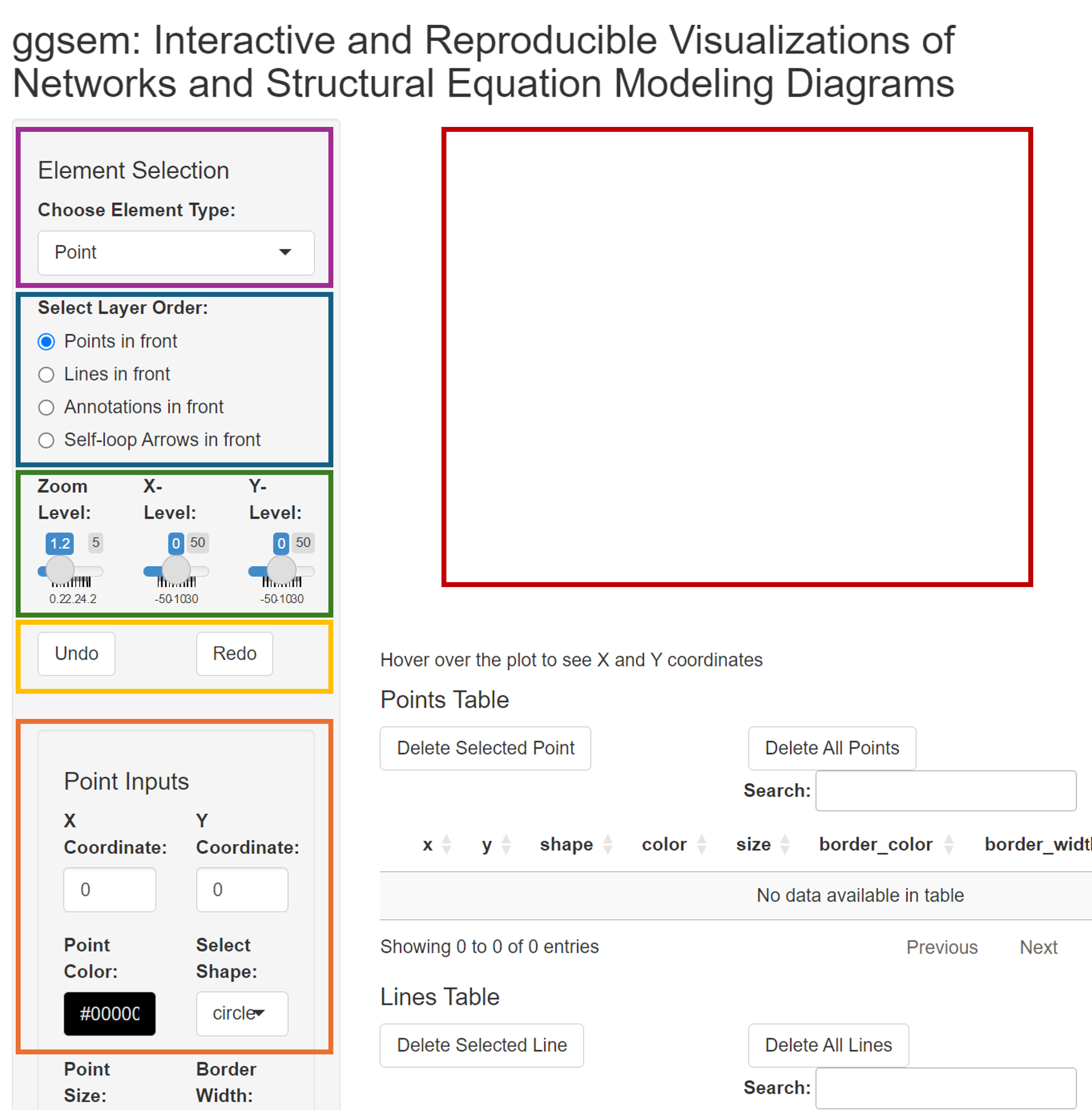
The picture shows the ggsem app. First, there’s space
where plots are rendered (red box). On the left side, there is a menu.
It begins with a dropdown menu for Element Selection,
allowing users to choose the type of graphical elements to add on the
plotting space (inside the purple box). There are five options for
Element Selection: Point,
Line, Text Annotation,
Self-loop Arrow, and Lavaan Input.
Below Element Selection, users can select the order of the layer in how the graphical elements are displayed (inside the blue box). The default is set so that points are most at the front. In other words, when a line and a point overlap, a point will mask the line.
Next, there is a slider for Zoom Level (within the green box). The default is set to a factor of 1.2x but it can be increased to zoom out (all the way to a factor of 10). This slider can be adjusted using a mouse or keyboard (left & right arrow buttons).
Then, there are sliders for Horizontal Position and Vertical Position (in the green box). This changes the focus of the plotting space that is displayed. For instance, if a point is cutoff on the right side of the plotting space because the space is not enough, simply adjust the slider for Horizontal Position.
Furthermore, there are Undo and Redo buttons (in the yellow box). These correspond to CTRL + Z and CTRL + Y. respectively. To illustrate, if you have accidently deleted a line, then simply click the Undo button to cancel the most previous action. The app remembers all steps of inputs, so Undo button can work all the way back to the beginning.
Finally, there is menu (within the orange box) that has specific input depending on the selected menu in Chose Element Type. Without further ado, let’s add graphical elements and see how these options interact together.
Adding Elements
Adding Points
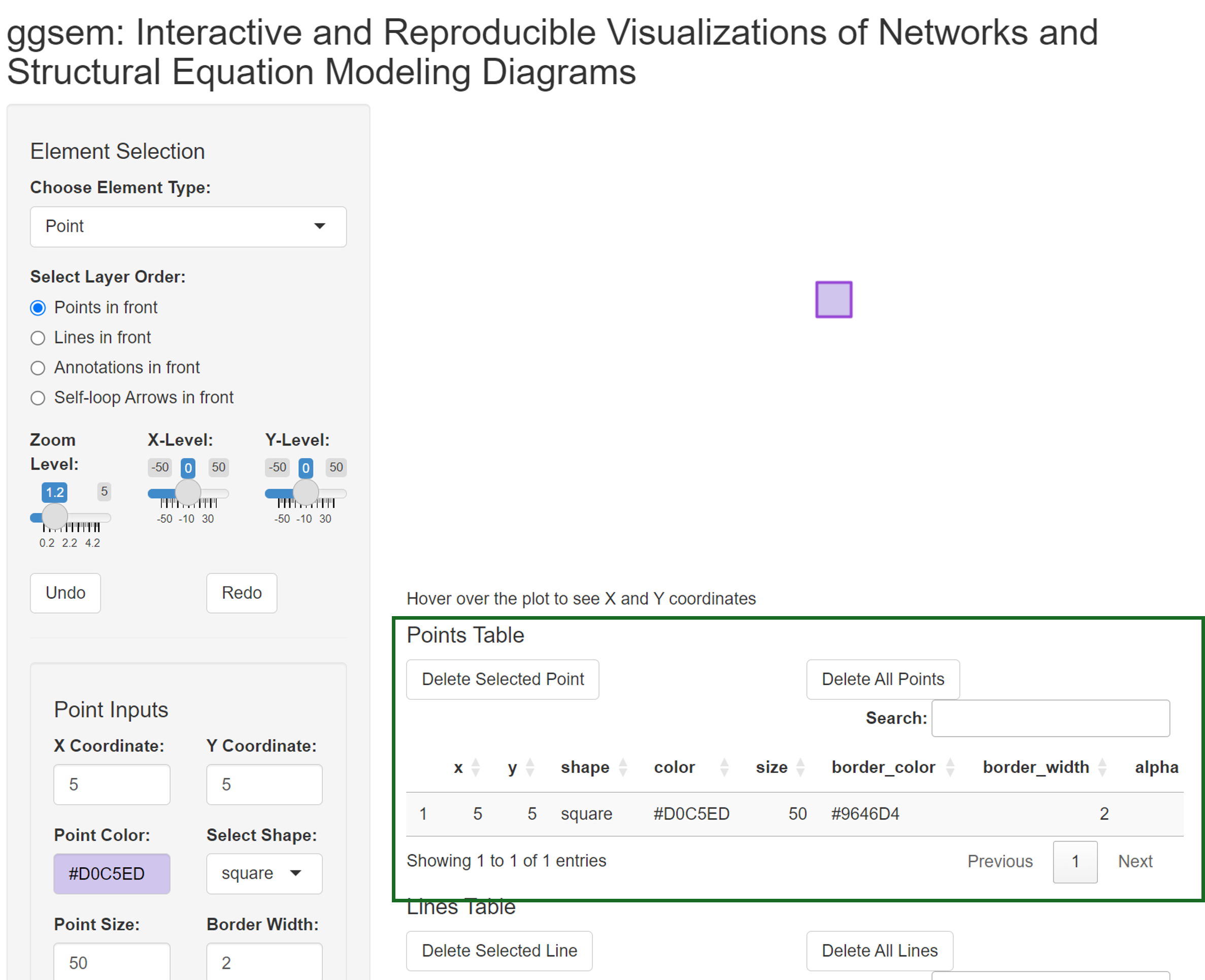
Lets begin by adding a point. The default coordinate of its X and Y position corresponds to the origin (0, 0). After a point is created, users can hover their mouse point on the point and realize that the center of the point is at X = 0 and Y = 0, as shown on the bottom-left of the plotting space.
Users can provide several inputs to specify the aesthetics of the point. This includes not only its X and Y coordinates, but also its filling color (Point Color), shape (Select Shape), size (Point Size), width of the border (Border Width), color of the border (Border Color), alpha level (Point Alpha).
Here, We can draw a square point by setting the inputs as shown below:
- X Coordinate: 5
- Y Coordinate: 5
- Point Color: #D0C5ED
- Select Shape: square
- Point Size: 15
- Border Width: 2
- Border Color: #9646D4
- Point Alpha: 1
After these have been specified, please click the Add Point button (pink box) to render the output. If you make any mistakes, you can click the Undo button to cancel the changes.
Notice that the output that has just been created is now part of the output table for points (within the green box). Users can directly change the values within the table to directly change the aesthetics of the selected element, or delete a selected row (or all rows). Simply click a row of interest, and click the Delete Selected Point (in the green box).
Adding Lines
Next, we will add a line by selecting Line in the dropdown menu of Choose Element Type.
There are numerous parameters of aesthetics that users can specify. We can start by drawing a black line with these coordinates (and leave all other default inputs unchanged):
- Start X Coordinate: 2
- Start Y Coordinate: -2
- End X Coordinate: 8
- End Y Coordinate: -2
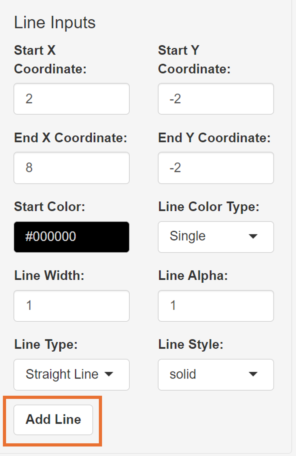
After the Add Line button has been clicked, a line will be drawn below the purple square. This line has a single color, as specified in the dropdown menu Line Color Type. The corresponding output in the table is shown in the orange box of the figure.
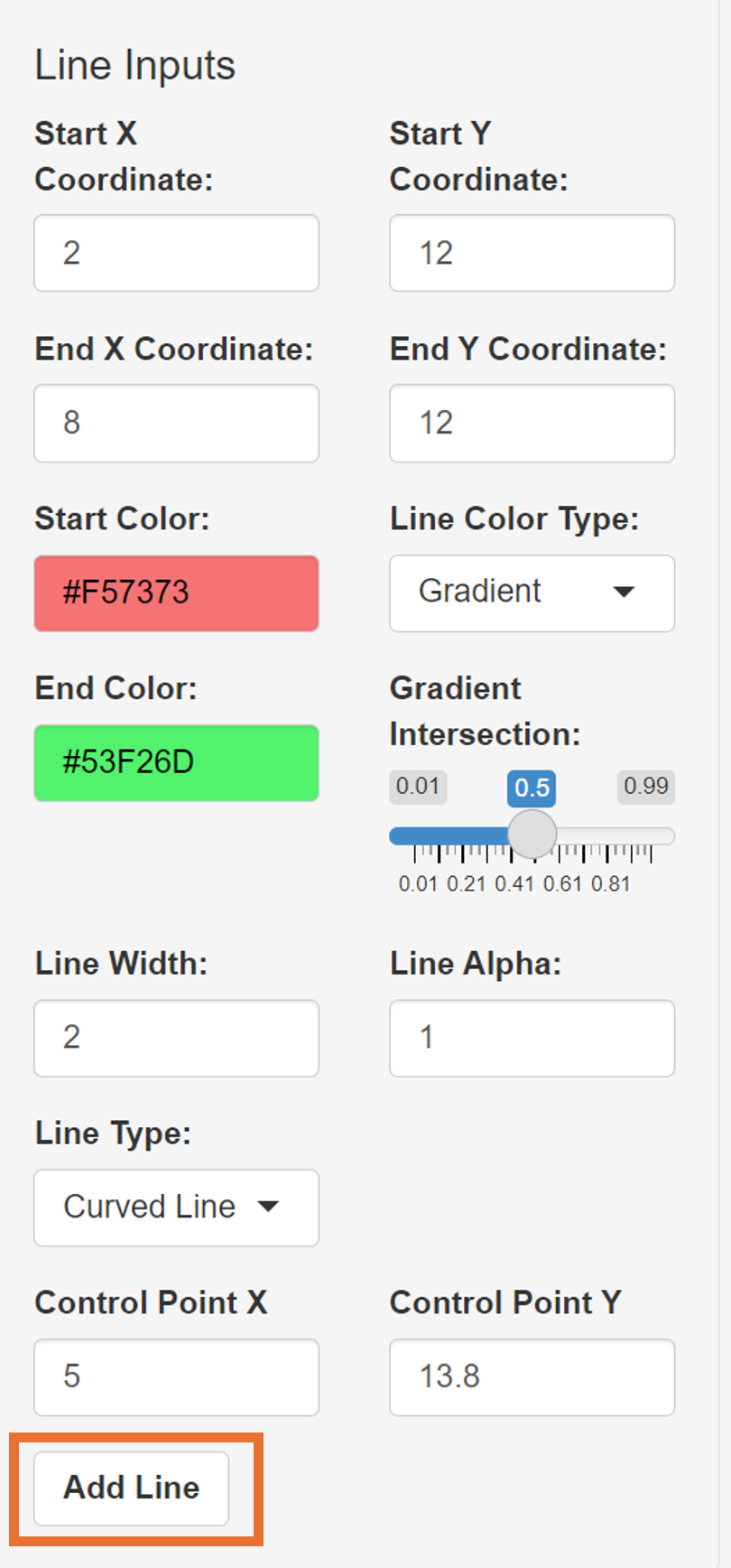
Next, we will draw a curved line, whose curvature is automatically adjusted based on the X and Y coordinates of the line segment but it can be manually adjusted by controlling Control Point X and Control Point Y. Additionally, we can set it to have a gradient between two colors by setting it as Gradient. After we choose Gradient, a conditional color menu will appear (End Color), as well as Gradient Intersection, which is a slider that allows us to give a fine control of where the gradient occurs in the line segment’s length.
- Start X Coordinate: 2
- Start Y Coordinate: 12
- End X Coordinate: 8
- End Y Coordinate: 12
- Start Color: #F57373
- Line Color Type: Gradient
- End Color: #53F26D
- Gradient Intersection: 0.5
- Line Width: 2
- Line Alpha: 1
- Line Type: Curved Line
If gradient intersection is either close to 0 or 1, then it will display one color more than the other. For instance, if its set to 0.01, the End Color will dominate the line segment.
Next, we will add an arrow by setting the dropdown menu Line Type as Straight Arrow, with these parameters below:
- Start X Coordinate: 18
- Start Y Coordinate: 5
- End X Coordinate: 12
- End Y Coordinate: 5
- Start Color: #9E9E9E
- Line Color Type: Gradient
- End Color: #54F5AF
- Gradient Intersection: 0.2
- Line Width: 2
- Line Alpha: 1
- Line Type: Straight Arrow
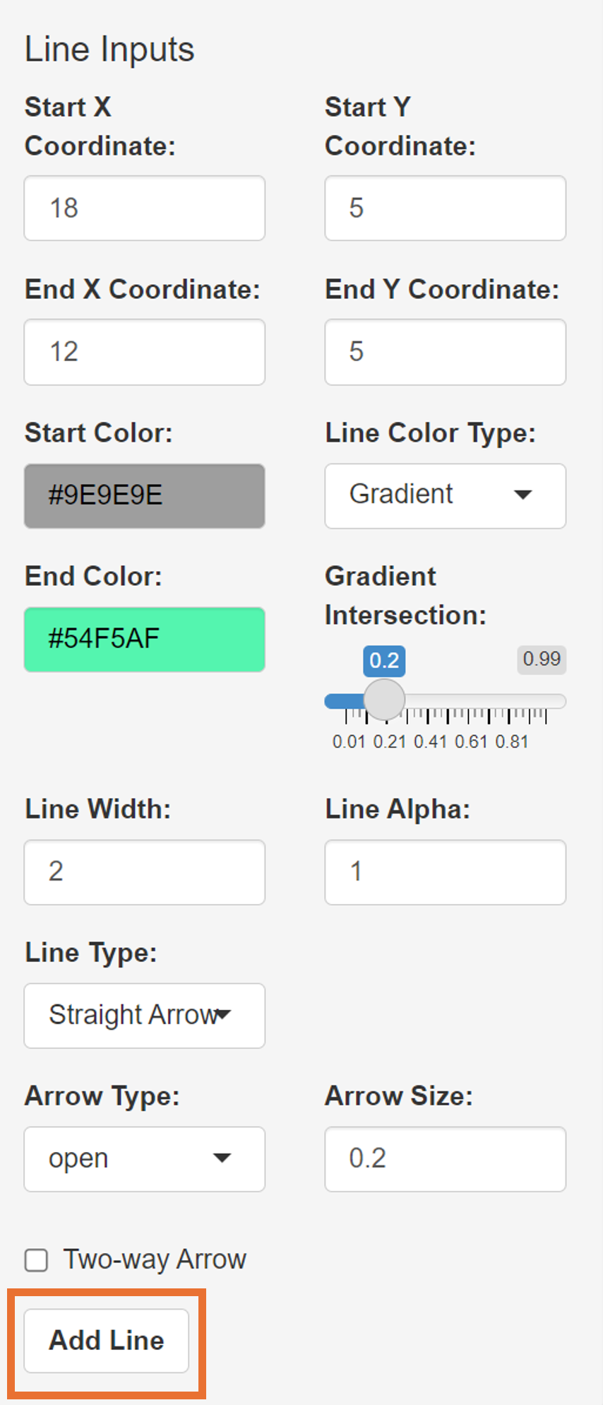
Leave the other inputs as intact, such as Arrow Type (open or closed arrowheads) and Arrow Size (size of the arrow head).
Adding Text Annotations
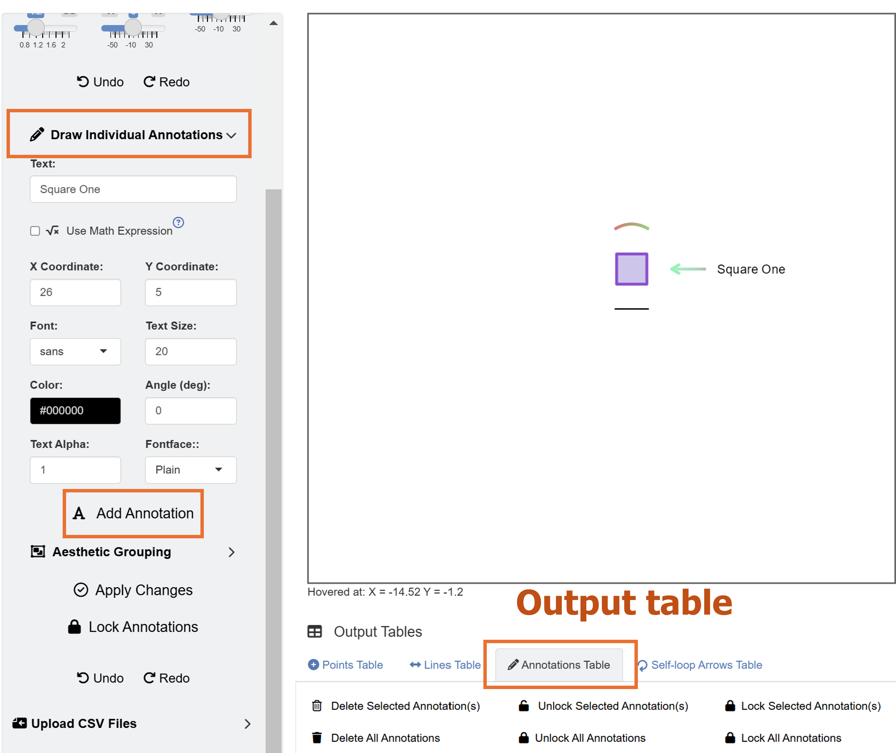
Now, we will add a text annotation beside the end of the arrow, labelled as “Square One” using these inputs below:
- Text: Square One
- X Coordinate: 26
- Y Coordinate: 5
- Font: sans
- Text Size: 20
- Color: #000000
- Angle (deg): 0
- Text Alpha: 1
- Typeface: Bold
After Add Text button is pressed, a text “Square One”” will be rendered. However, we see that the text has been cutoff on the right side because there is not enough plotting space. The X and Y coordinates of the text refer to the position of the text’s center.
Adding Self-loop Arrows
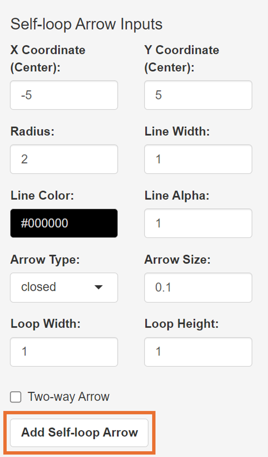
Finally, we can add a circular self-loop arrow on the plotting output using these inputs below:
- X Coordinate (Center): -5
- Y Coordinate (Center): 5
- Radius: 2
- Line Width: 1
- Line Color: #000000
- Line Alpha: 1
- Arrow Type: closed
- Arrow Size: 0.1
- Loop Width: 1
- Loop Height: 1
We can also use the slider X-Level to re-adjust the focus of the plotting space (using mouse or left/right arrows of the keyboard) so that the elements are in the center of the space:
- X-Level: 8
This will generate the self-loop arrow on the left side after the Add Self-loop Arrow button has been clicked.
Note that there are also Apply Changes and Lock Self-loop Arrows buttons (green box).
Apply Changes button: Changes the currently existing self-loop arrows’ Gap Size (between two ends of the arrow) and Loop Orientation (deg).
Lock Self-Loop Arrows button: Makes the currently existing self-loop arrows immune to the subsequent usages of the Apply Changes button. Only press if you are satisfied with the current orientation and gap size of the existing self-loop arrow.
Saving Data and Graphics
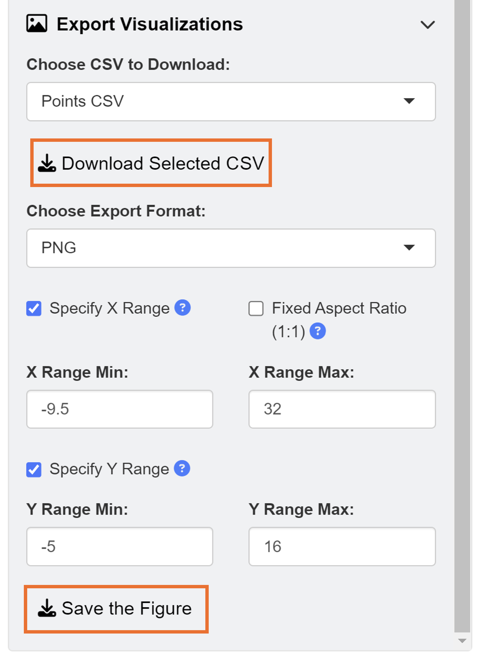
Notice that whenever we add graphical element onto the plotting space, the output table gets updated. There are four tables total: 1) Points Table, 2) Lines Table, 3) Annotations Table, and 4) Self-loop Arrows Table. Users can directly manipulate the aesthetics of elements by modifying the numiercal inputs in the table, such as x and Y coordinates and alpha level. They can also save the CSV files, close the ggsem app, and the load them again to continue working on the figures later in the future.
To download each of the four tables, go down to the dropdown menu Choose CSV to Download, and click the button Download Selected CSV, for each of the four tables.
To reload the CSV files back into the app, users can click Browse under Upload CSV Files to locate their CSV files of their interest.
The output image can also exported as either PNG, JPEG, PDF or SVG in specific X and Y ranges. If you want to save the figure with asymmetric dimensions, make sure to uncheck Fixed Aspect Ratio.
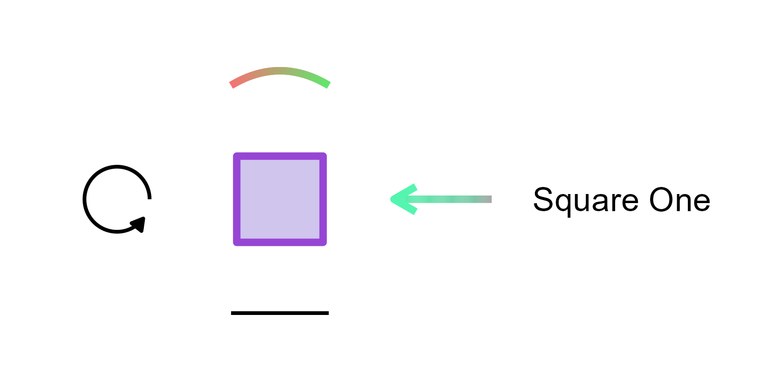
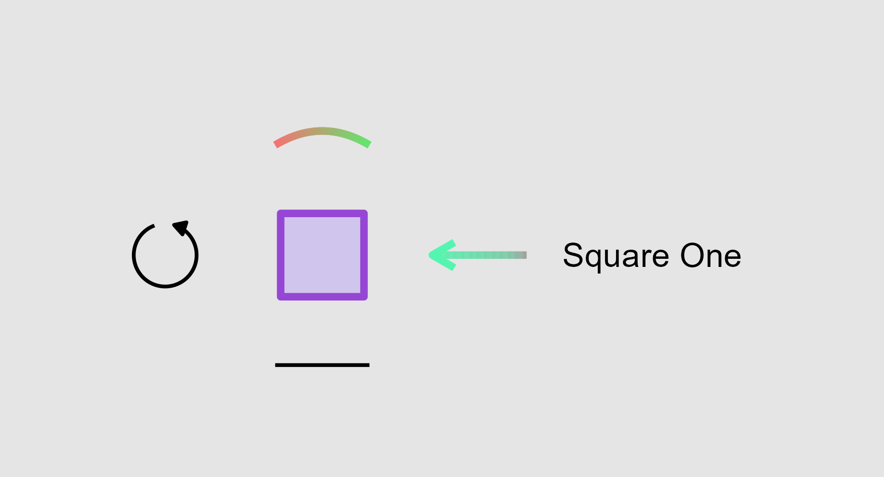
This picture is the directly exported PNG output from the web application.
Modifying the Plot from ggsem app in ggplot2 Workflow
The plot that we have generated can be recreated as a ggplot
object in RStudio using the function csv_to_ggplot(), which
might take some time to run if the CSV of line include gradient
settings. To reduce its time, you can choose to reduce the value of
n (default value = 100) to a lower value, which is an
argument that is used to set the resolution of the gradient coloring and
curvature of the line.
library(tidyverse)
library(ggsem)

# CSV files from ggsem app
points_data <- read_csv("https://www.smin95.com/points.csv")
lines_data <- read_csv("https://www.smin95.com/lines.csv")
annotations_data <- read_csv("https://www.smin95.com/annotations.csv")
loops_data <- read_csv("https://www.smin95.com/loops.csv")

p1 <- csv_to_ggplot(
  points_data = points_data,
  lines_data = lines_data,
  annotations_data = annotations_data,
  loops_data = loops_data,
  zoom_level = 1.2, # From the ggsem app
  horizontal_position = 8, # From the ggsem app
  vertical_position = 0,
  n = 100
) # Default vertical position on the app
We can save the figure as a PNG file to verify whether it is
identical to the one we have drawn on the ggsem web app. Here,
we set width = 9 and height = 9 as the
dimension of the exported image file.
ggsave("p1.png", p1, width = 9, height = 9)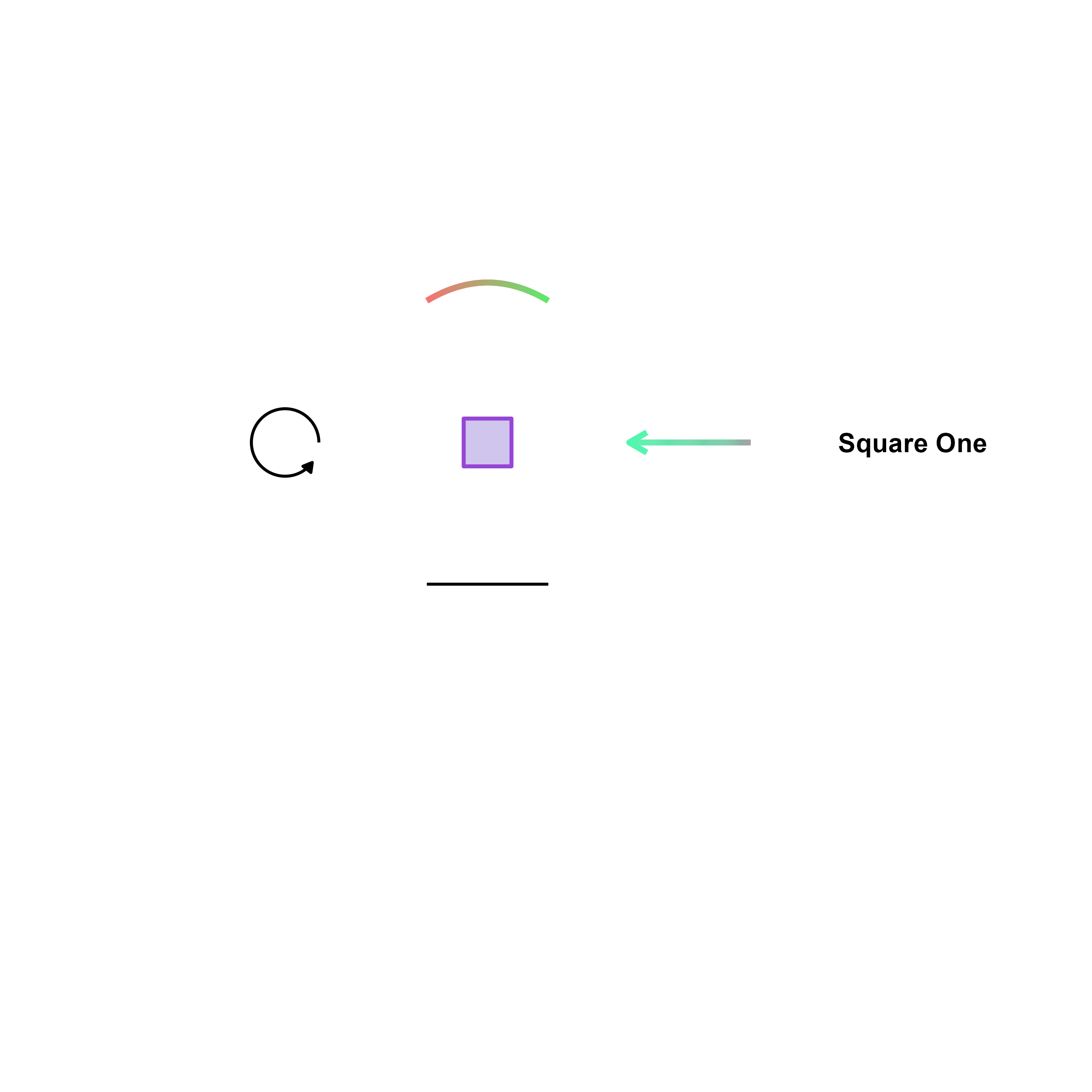
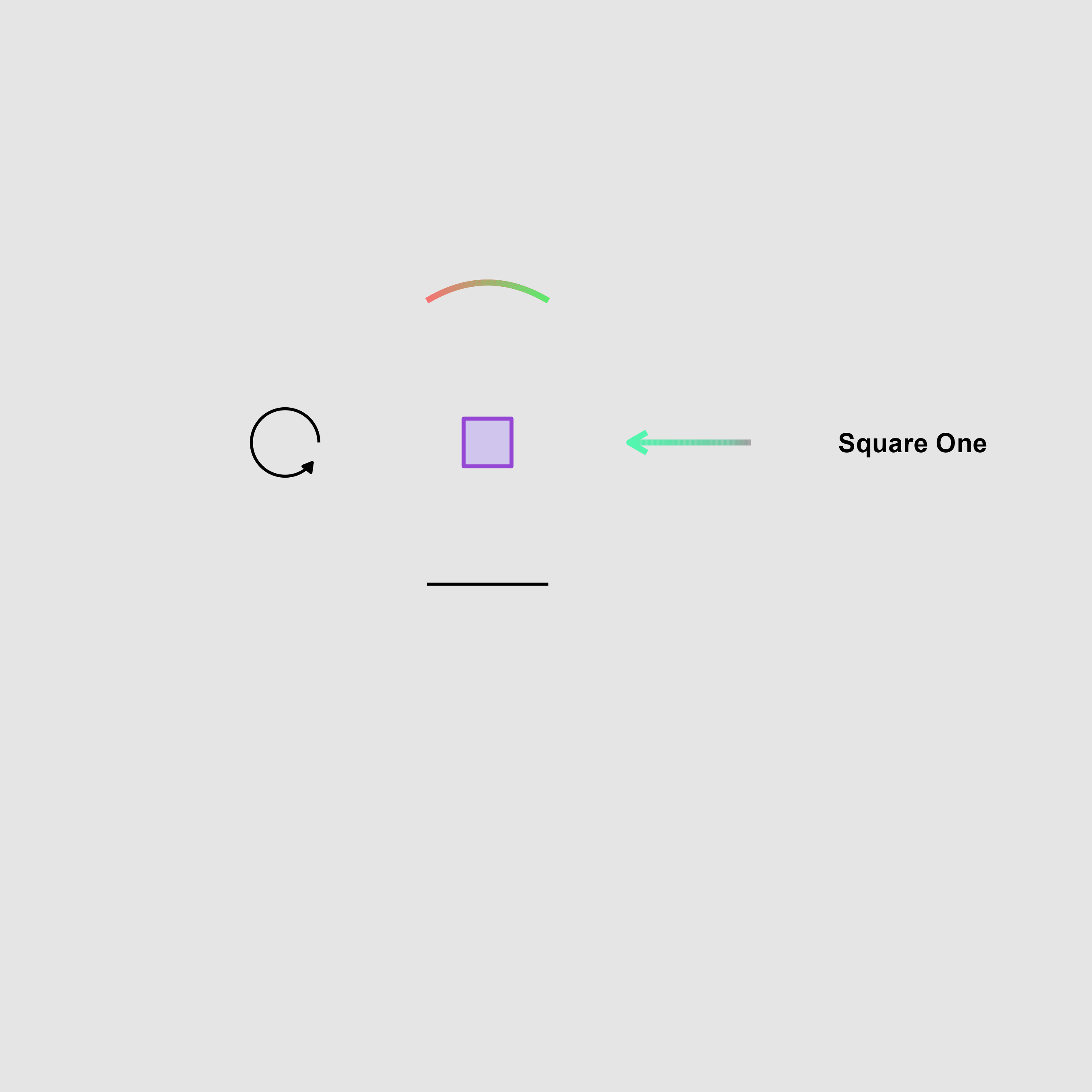
We can also add a plot light-grey (grey90) background to
our graphical output using typical ggplot2 functions and change the
range of the y-axis.
p2 <- p1 + theme(
  plot.background = element_rect(fill = "grey90", color = NA) # Grey background, no border
)
There is a lot of empty space here, which we can chip away by
directly dealing with the axis limits of the figure using
adjust_axis_space(). It handles removal of empty space
asymmetrically. There are important arguments: 1)
x_adjust_left_percent: Percentage by which to expand or
shrink the left boundary of the x-axis, 2)
x_adjust_right_percent: Percentage by which to expand or
shrink the right boundary of the x-axis, 3)
y_adjust_top_percent: Percentage by which to expand or
shrink the bottom boundary of the y-axis, and 4)
y_adjust_bottom_percent: Percentage by which to expand or
shrink the top boundary of the y-axis.
We will remove 30% of the left side of the x axis range, 20% on the right of the x-axis range, 32% of the top side of y-axis range, and 43% of the bottom side of the y-axis range (as shown below).
p2b <- adjust_axis_space(p2, x_adjust_left_percent = -30,
                         x_adjust_right_percent = -20,
                         y_adjust_top_percent = -30,
                         y_adjust_bottom_percent = -43)
Then, save the figure using save_figure() (a function
from ggsem), which automatically chooses the optimal width and
height of the image based on its x and y ranges.
save_figure("p2b.png", p2b)Tip: If you are not satisfied with the automatic
adjustment of the plot’s dimension through save_figure(),
use ggsave() to either adjust width or
height (or both).
