Chapter 5 Bar Graph, Slope Chart and Point plot
Citing the Guide and the Package
If you have used smplot2 for your visualization routines, please cite one of the papers below:
Min, S. H. (2024). Visualization of composite plots in R using a programmatic approach and smplot2. Advances in Methods and Practices in Psychological Science, 7(3). [pdf] [codes]
Min, S. H., & Zhou, J. (2021). smplot: an R package for easy and elegant data visualization. Frontiers in Genetics, 12, 802894. [pdf] [codes]
Getting Started
These packages are required to be loaded in this chapter, where we will focus on drawing a bar graph, slope chart and point plot. I think these three plots are most commonly used in my research field (perceptual science).
5.1 Bar graph
Even if a bar graph does not provide as much information as a boxplot or a violin plot, it has been proved extremely useful due to its minimal aesthetics. Moreover, in general, providing a bar, jittered individual points and a respective error bar is enough in psychological research.
For this reason, I think that it is necessary to discuss in detail about the usage of bar graph.
Over time, I’ve learned that many users directly use the aesthetic defaults of sm_bar(). So in this chapter, we will discuss ways to overcome the defaults.
set.seed(211) # generate random data
group1 <- abs(rnorm(20, 2.5, 1))
group2 <- abs(rnorm(20, 5, 1))
Subject <- rep(paste0("S", seq(1:20)), 2)
Data <- data.frame(Value = matrix(c(group1, group2), ncol = 1))
Group <- rep(c("Group 1", "Group 2"), each = length(group1))
df <- cbind(Subject, Data, Group)
After generating the random data, let’s plot a bar graph. In this case, there are two distinct instances / time points.
ggplot(data = df, mapping = aes(x = Group, y = Value, color = Group)) +
  sm_bar() +
  scale_color_manual(values = sm_color("blue", "orange")) +
  ggtitle("A bar graph")
sm_bar() automatically uses sm_hgrid(), which provides horizontal major grids. Moreover, it has arguments borders and legends so that the user can wish to remove border or legend easily.
ggplot(data = df, mapping = aes(x = Group, y = Value, color = Group)) +
  sm_bar(borders = FALSE) +
  scale_color_manual(values = sm_color("blue", "orange")) +
  ggtitle("A bar graph")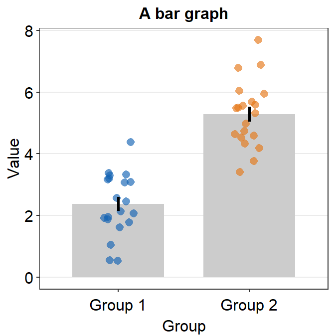
The default of the error bar’s type is standard error, i.e., errorbar_type = 'se'. There are three options: standard error (se), standard deviation (sd) and 95% confidence interval (ci). The sd and ci are shown below.
ggplot(data = df, mapping = aes(x = Group, y = Value, color = Group)) +
  sm_bar(errorbar_type = "sd") +
  scale_color_manual(values = sm_color("blue", "orange")) +
  ggtitle("A bar graph")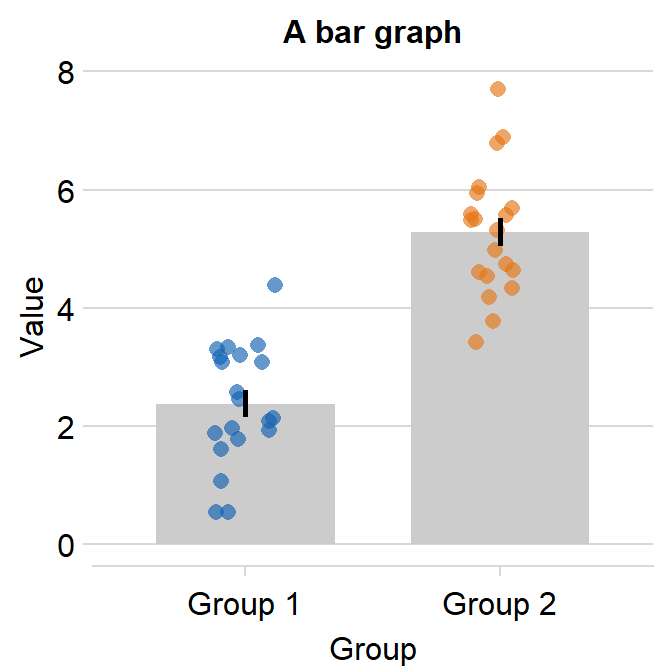
ggplot(data = df, mapping = aes(x = Group, y = Value, color = Group)) +
  sm_bar(errorbar_type = "ci") +
  scale_color_manual(values = sm_color("blue", "orange")) +
  ggtitle("A bar graph")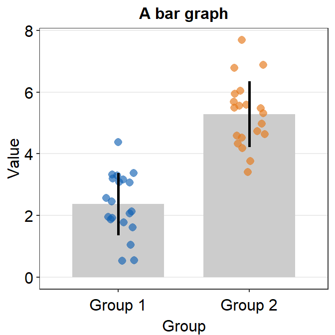
You can also use theme() to finely modify the aesthetics. For instance, you can remove the title of the x-axis Group. ylab() and xlab() are functions to modify the title of y- and x-axes.
ggplot(data = df, mapping = aes(x = Group, y = Value, color = Group)) +
  sm_bar() +
  scale_color_manual(values = sm_color("blue", "orange")) +
  theme(axis.title.x = element_blank()) +
  ggtitle("Reading performance in children") +
  ylab("Reading speed")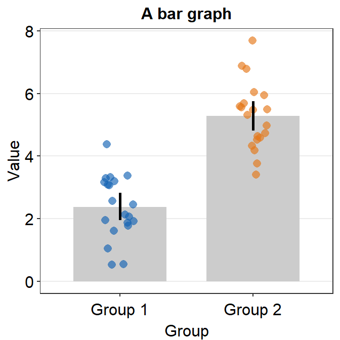
5.1.1 Scaling the y-axis
Upon a closer look, we realize that the y-axis starts from below 0 even if all data are higher than 0. We can specify the y-axis limit manually using scale_y_continuous() between 0 and 8.
ggplot(data = df, mapping = aes(x = Group, y = Value, color = Group)) +
  sm_bar() +
  scale_color_manual(values = sm_color("blue", "orange")) +
  theme(axis.title.x = element_blank()) +
  ggtitle("Reading performance in children") +
  ylab("Reading speed") +
  scale_y_continuous(limits = c(0, 8))
Although we have specified that the y-axis limit begins from 0 and ends at 7, there is still a small margin below 0. What is going on here?
The default of ggplot2 is that there is always a small margin below the lowest point of the y-axis limit and above the largest point of the y-axis.The empty space below 0 and above 7 can be removed by using expand = c(0,0) within scale_y_continuous().
ggplot(data = df, mapping = aes(x = Group, y = Value, color = Group)) +
  sm_bar() +
  scale_color_manual(values = sm_color("blue", "orange")) +
  theme(axis.title.x = element_blank()) +
  ggtitle("Reading performance in children") +
  ylab("Reading speed") +
  scale_y_continuous(limits = c(0, 8), expand = c(0, 0))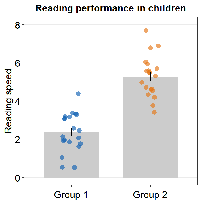
If you would like a small margin between the bottom of the plot and the bars, you could so by replacing 0 with 0.05, i.e., expand = c(0,0.05). Then the vertical margin will slightly increase.
ggplot(data = df, mapping = aes(x = Group, y = Value, color = Group)) +
  sm_bar() +
  scale_color_manual(values = sm_color("blue", "orange")) +
  theme(axis.title.x = element_blank()) +
  ggtitle("Reading performance in children") +
  ylab("Reading speed") +
  scale_y_continuous(limits = c(0, 8), expand = c(0, 0.05))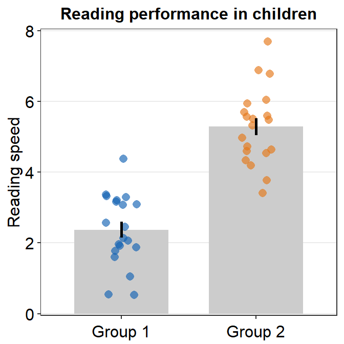
5.1.2 Plotting individual points with unique colors
Plotting each point with distinct color is possible if each color is specified for each subject as part of the aesthetics, i.e., aes(..., color = Subject), where Subject is the name of the data frame’s column that provides identifiers for each observation/person.
ggplot(data = df, mapping = aes(x = Group, y = Value, color = Subject)) +
  sm_bar() +
  theme(axis.title.x = element_blank()) +
  ggtitle("Reading performance in children") +
  ylab("Reading speed") +
  scale_y_continuous(limits = c(0, 8), expand = c(0, 0.05)) +
  scale_color_manual(values = sm_palette(16))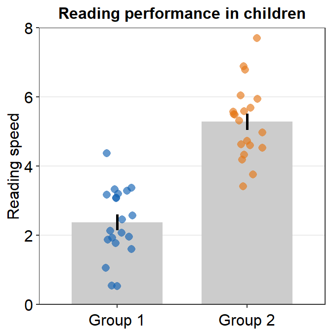
5.1.3 Other parameters
You can also control the jitter’s width by setting point_jitter_width. The default is sm_bar(..., point_jitter_width = 0.12). Let’s increase it to 0.2.
ggplot(data = df, mapping = aes(x = Group, y = Value, color = Subject)) +
  sm_bar(point_jitter_width = 0.2) +
  theme(axis.title.x = element_blank()) +
  ggtitle("Reading performance in children") +
  ylab("Reading speed") +
  scale_y_continuous(limits = c(0, 8), expand = c(0, 0.05)) +
  scale_color_manual(values = sm_palette(16))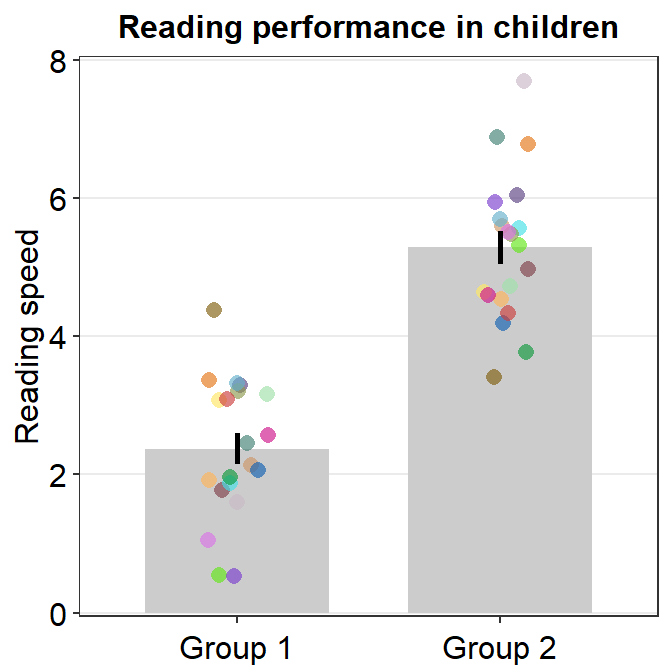
You can also adjust different parameters of the bar graph using bar.params, err.params and point.params.
bar.params = list()feeds arguments, such ascolor,fill,widthandalphatogeom_bar()to plot the bar.err.params = list()feeds arguments, such ascolor, togeom_linerange()to plot the error bar.point.params = list()feeds arguments, such ascolor,fill, andalphatogeom_point()to plot the jittered individual points....is generic argument that can affect the bar graph, error bar and points if these do not have defaults set withinbar.params = list(),err.params = list()andpoint.params = list().
In the example below, various aspects of the plot have been modified, such as the bar’s width, alpha as well as points’ stroke, which refers to the thickness of their border.
ggplot(data = df, mapping = aes(x = Group, y = Value, fill = Group)) +
  sm_bar(
    bar.params = list(width = 0.5, alpha = 0.5),
    point.params = list(
      shape = 21, color = "white",
      stroke = 0.75, alpha = 1
    )
  ) +
  scale_y_continuous(limits = c(0, 8), expand = c(0, 0.05)) +
  scale_fill_manual(values = sm_color("blue", "orange"))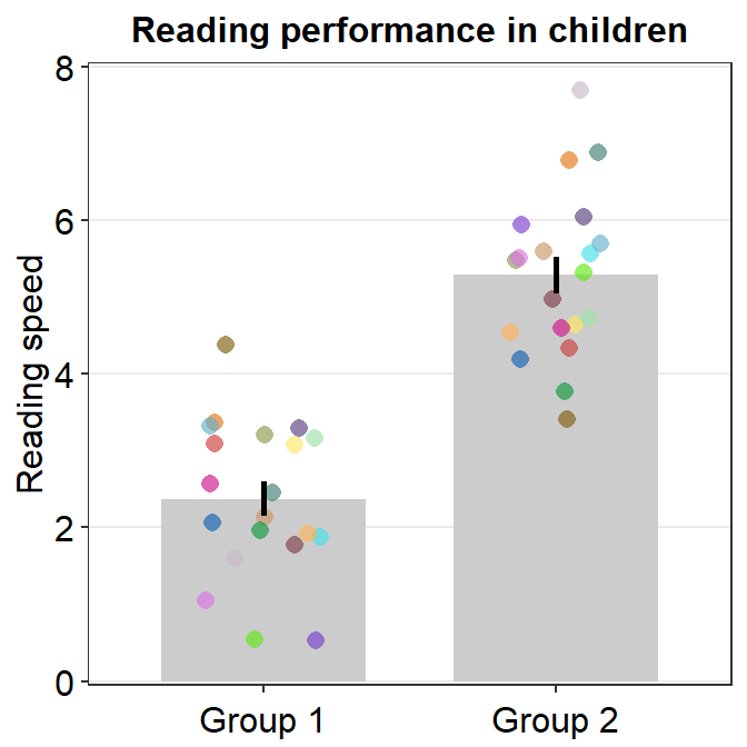
In the visualization functions of smplot2, argument for
aesthetics that are not re-specified in list() follow the
defaults of smplot2. If only one of them gets re-specified,
then that one will get modified as specified but others will still
retain the default appearance.
Below, we change the color (fill) of the bar instead but keep all other features of the bar by not specifying the inputs.
ggplot(data = df, mapping = aes(x = Group, y = Value, fill = Group)) +
  sm_bar(
    bar.params = list(fill = "gray60"),
    point.params = list(
      shape = 21, color = "white",
      stroke = 0.75, alpha = 1
    )
  ) +
  scale_y_continuous(limits = c(0, 8), expand = c(0, 0.05)) +
  scale_fill_manual(values = sm_color("blue", "orange"))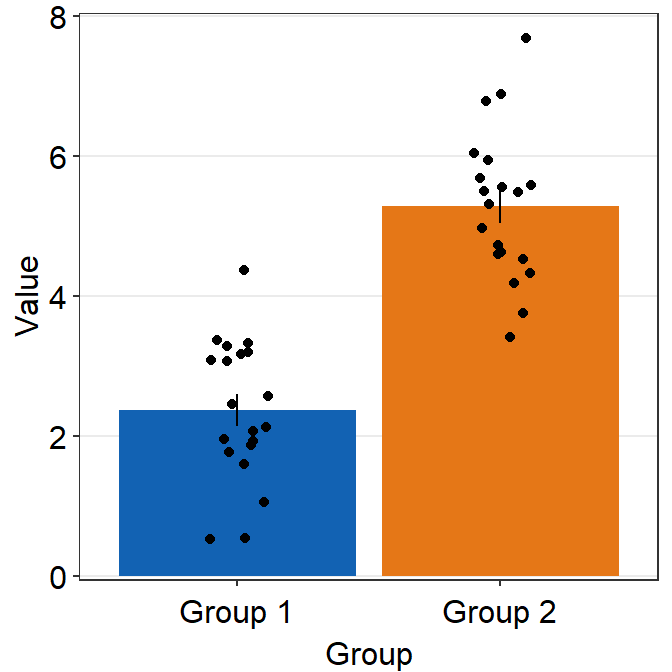
Defaults of sm_bar() can be accessed by typing ?sm_bar(). You can also set to remove the points by using points argument (points = FALSE).
ggplot(data = df, mapping = aes(x = Group, y = Value, fill = Group)) +
  sm_bar(point.params = list(
    shape = 21, color = "white",
    stroke = 0.75, alpha = 1
  ), points = FALSE) +
  scale_y_continuous(limits = c(0, 8), expand = c(0, 0.05)) +
  scale_fill_manual(values = sm_color("blue", "orange"))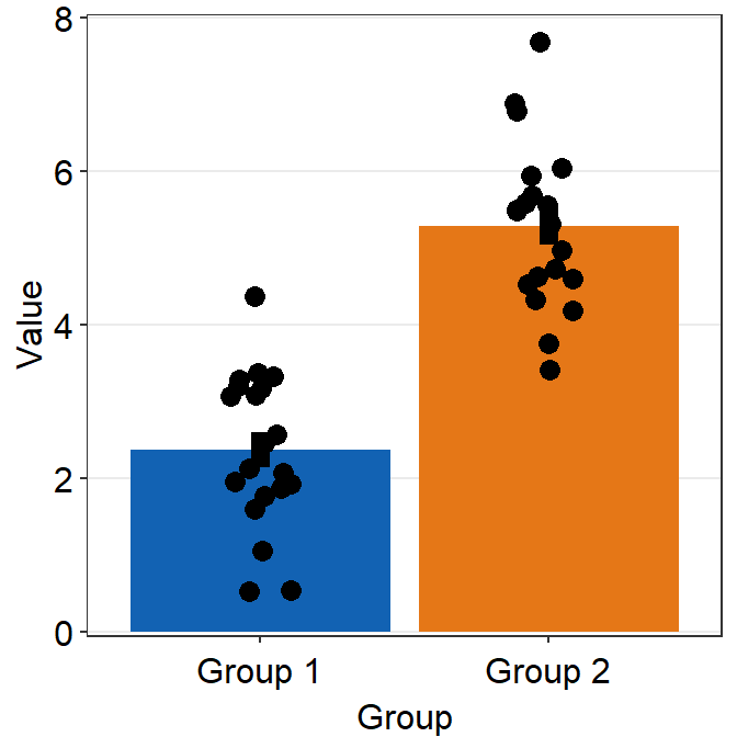
We can see that sm_bar() can offer a huge flexibility for users to control over the aesthetics with relative ease while maintaining the minimalistic style.
5.1.4 Bar graph with data of multiple groups
In this section, we will load data set from online. Details about the data set are described in the section below entitled Point Plot. You do not need to understand the data set to follow this section.
df2 <- read_csv("https://www.smin95.com/amblyopia_random.csv")
df2a <- filter(df2, Condition == "One")
df2a <- filter(df2, SF %in% c(0.5, 8))
df2a$SF <- as.factor(df2a$SF)
df2a$Group <- as.factor(df2a$Group)
unique(df2a$Group)
## [1] Amblyopia Normal
## Levels: Amblyopia NormalWe see that there are two groups in the data set: Amblyopia and Normal.
## [1] 0.5 8
## Levels: 0.5 8
Also there are two conditions SF: 0.5 and 8.
Ideally, a plot that shows the data of these two groups and conditions would be very informative. Let’s attempt to plot such a bar graph.
ggplot(data = df2a, aes(x = SF, y = absBP, color = SF)) +
  sm_bar() +
  scale_color_manual(values = sm_color("blue", "orange"))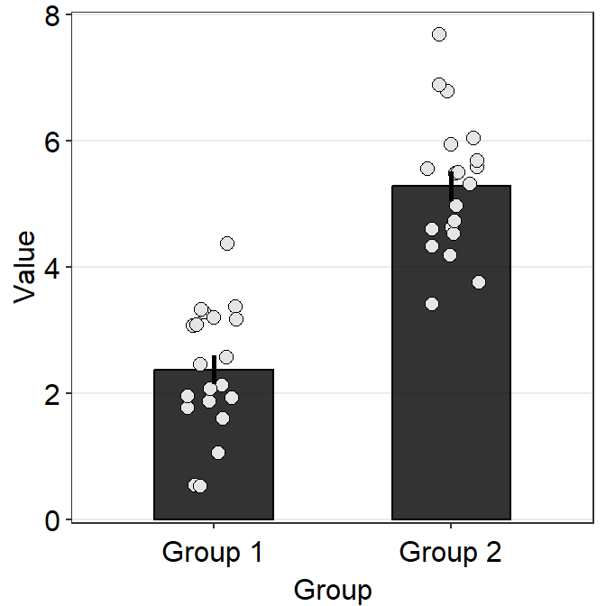
Immediately we see that something is wrong here. There seem to be too many points in this bar graph compared to the sample size of each group per condition.
df2amb <- filter(df2a, Group == "Amblyopia")
df2norm <- filter(df2a, Group == "Normal")
length(unique(df2amb$Subject)) # 10 amblyopes
## [1] 9## [1] 9There are 10 subjects per group (Group) and condition (SF) but we see about 20 points per bar. It seems that the data of Amblyopia and Normal got combined at each SF. This is not a good representation of the data as we are interested in the difference between the two groups of observers.
Let’s add group = Group within aes() to group the data based on each Group.
ggplot(data = df2a, aes(x = SF, y = absBP, color = SF, group = Group)) +
  sm_bar() +
  scale_color_manual(values = sm_color("blue", "orange"))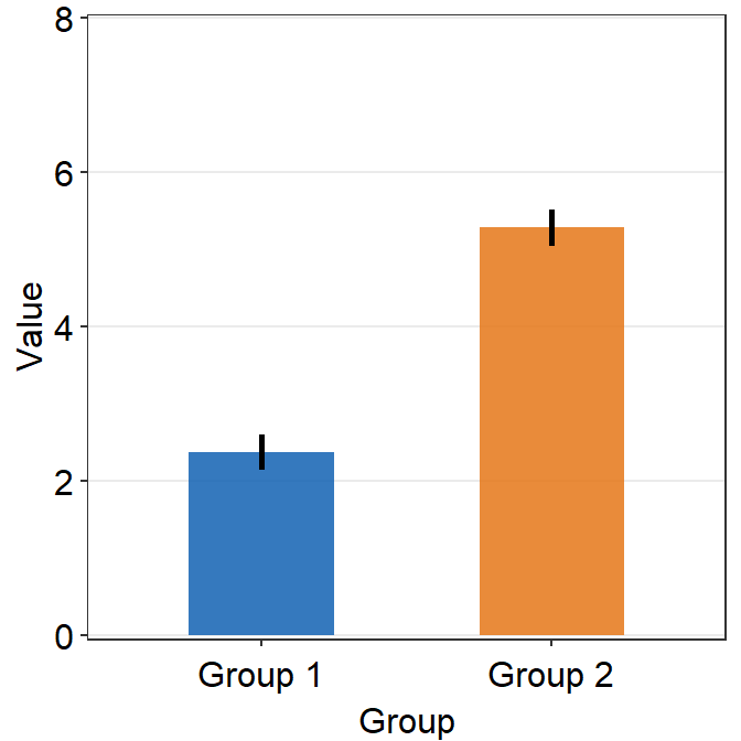
We see there are two error bars in the midst of the orange plots, indicating that the data are superimpsoed on top of another. Let’s change border color of the bar to verify this observation.
ggplot(data = df2a, aes(x = SF, y = absBP, color = SF, group = Group)) +
  sm_bar(
    alpha = 0.3,
    bar.params = list(color = "black")
  ) +
  scale_color_manual(values = sm_color("blue", "orange"))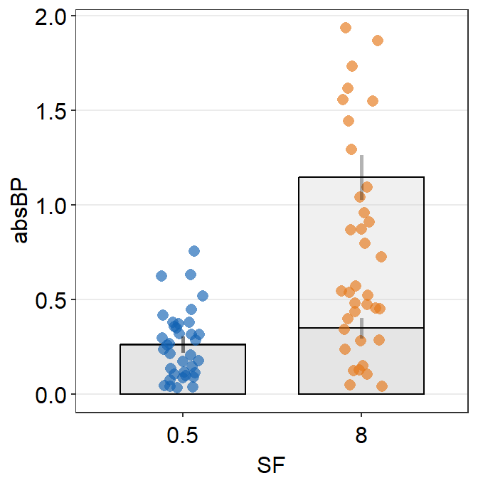
In fact, it turns out that our observation is true. We need to separate their position (i.e., dodge) using position_dodge() across all visual components of the bar graph: err.params, bar.params and point.params. This can be done easily by setting it as a generic parameter ....
ggplot(data = df2a, aes(x = SF, y = absBP, color = Group, group = Group)) +
  sm_bar(
    position = position_dodge(width = 1),
    legends = T,
    bar.params = list(width = 0.8)
  ) +
  scale_color_manual(values = sm_color("blue", "orange"))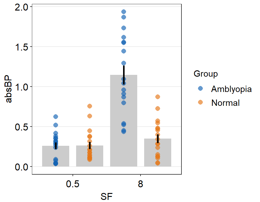
Let’s add some jitter to the points. This part is quite complicated. In this example, point.params has to be set separately using position_jitterdodge() so that the points remained jittered and dodged at the same time.
ggplot(data = df2a, aes(x = SF, y = absBP, color = Group, group = Group)) +
  sm_bar(
    position = position_dodge(width = 1),
    bar.params = list(width = 0.8),
    point.params = list(
      alpha = 0.5,
      position = position_jitterdodge(
        jitter.width = 0.12,
        dodge.width = 1
      )
    ),
    legends = T
  ) +
  scale_color_manual(values = sm_color("blue", "orange")) +
  scale_y_continuous(expand = c(0, 0.05))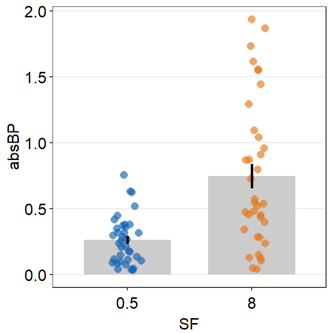
We have now successfully plotted the bar graph using data of multiple groups and conditions. Another solution is to plot each group per panel and combine the two panels into one figure using sm_common_axis(), which will be described in the later part of the book.
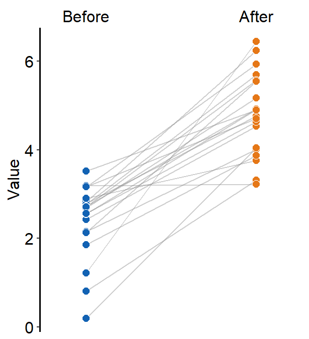
5.2 Slope chart
A slope chart is useful to describe changes between two different time points for each measurement (ex. a participant).
Sometimes, it is a great alternative to showing bar graph because bar graph does not show individual trends/changes.
Let’s generate some random data to explore this difference.
set.seed(201) # generate random data
before <- abs(rnorm(20, 2.5, 1))
after <- abs(rnorm(20, 5, 1))
Subject <- rep(paste0("S", seq(1:20)), 2)
Data <- data.frame(Value = matrix(c(before, after), ncol = 1))
beforeAfter <- rep(c("Before", "After"), each = length(before))
df <- cbind(Subject, Data, beforeAfter)
As mentioned in the previous, factor level is important when dealing with discrete variable. In this case, the two factor levels of the data are Before and After.
Since, in the context of time, Before is the first level followed by After, let’s set the level properly so that the alphabetical order is overturned.
##  [1] Before Before Before Before Before Before Before Before Before Before Before Before Before Before Before Before Before Before Before Before After  After  After  After  After  After  After  After
## [29] After  After  After  After  After  After  After  After  After  After  After  After
## Levels: Before After
Based on the output, we have successfully ordered the factor levels. Now, we can start plotting a slope chart.
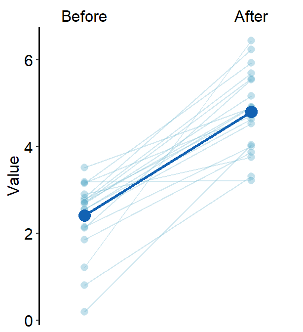
ggplot(data = df, aes(x = beforeAfter, y = Value, fill = beforeAfter)) +
  sm_slope(group = Subject) +
  scale_fill_manual(values = sm_color("blue", "orange"))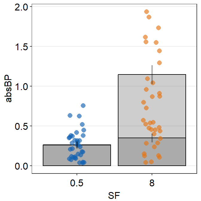
Notice that each line is grouped for each subject. For this to properly happen, group argument has to be specified within sm_slope(). In fact, due to the update from smplot2, the user is required to specify this at the level of sm_slope() rather than at aes().
Also, to assign a unique color to each discrete level in x-axis, fill has to be specified because the default shape of the point is 21, which is a circle with borders.
Now let’s add labels for the x-axis tick. To do so, include labels = c('Before', 'After').
ggplot(data = df, aes(x = beforeAfter, y = Value, fill = beforeAfter)) +
  sm_slope(group = Subject, labels = c("Before", "After")) +
  scale_fill_manual(values = sm_color("blue", "orange"))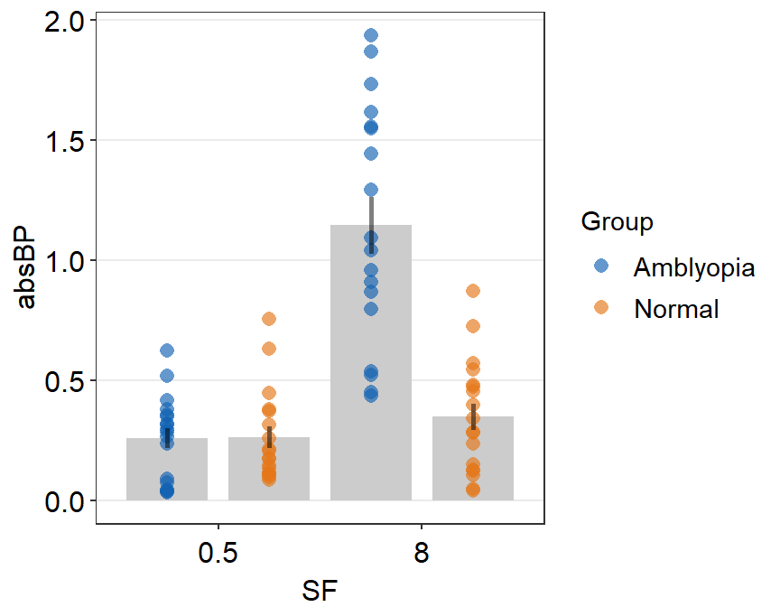
If you would like to do statistical test that is paired, such as a paired t-test, then the apt means to visualize the data would be to use slope chart, rather than a bar graph. This is because the p-value gets smaller as a larger proportion of the sample experiences a change in the same direction (i.e., all increase). It is the direction of the overall change that is important, rather than the difference of the means from unique groups/conditions/instances.
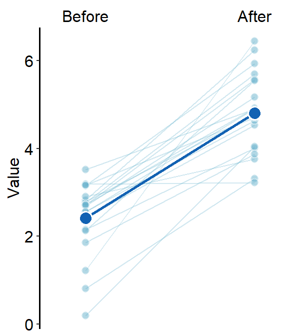
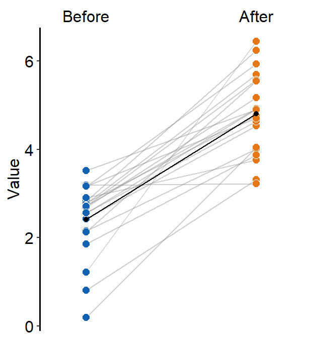
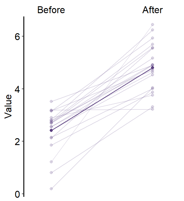
5.2.1 Slope chart with mean plot
Due to several requests from students, I have added the feature of showing a mean plot using sm_slope() as an update from smplot2.
Just by setting show_mean = TRUE, you can draw the mean.
ggplot(data = df, aes(x = beforeAfter, y = Value, fill = beforeAfter)) +
  sm_slope(
    labels = c("Before", "After"), group = Subject,
    show_mean = TRUE
  ) +
  scale_fill_manual(values = sm_color("blue", "orange"))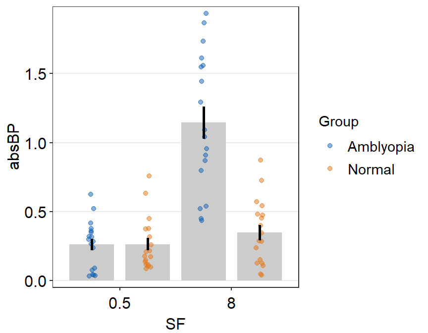
When a mean plot is included in slope chart, I personally prefer to visually emphasize the mean plot while treating the individual plots as shadow. Hence, I would use similar colors across all levels. Here is an example below using blue colors. The mean plot should be slightly larger than the individual points from the shadow.
ggplot(data = df, aes(x = beforeAfter, y = Value)) +
  sm_slope(
    labels = c("Before", "After"), group = Subject,
    point.params = list(
      alpha = 0.4, size = 2.5, color = "white",
      shape = 21, fill = sm_color("skyblue")
    ),
    line.params = list(
      color = sm_color("skyblue"),
      alpha = 0.3
    ),
    avgPoint.params = list(
      color = "transparent", shape = 21,
      size = 4, fill = sm_color("blue")
    ),
    avgLine.params = list(color = sm_color("blue"), size = 1),
    show_mean = TRUE
  )
point.paramsfeeds arguments togeom_point()to plot the points with specifiedcolor,fill,size,shapeandalpha.line.paramsfeeds arguments togeom_line()to plot the points with specifiedcolor,sizeandalpha.avgPoint.paramsfeeds arguments togeom_point()to plot the average point with specifiedcolor,fill,size,shapeandalpha.avgLine.paramsfeeds arguments togeom_line()to plot the average plot (line) with specifiedcolor,sizeandalpha.err.paramsfeeds arguments togeom_linerange()to plot the error bar with specifiedcolor,sizeetc.xtick.paramsfeeds arguments toscale_x_discrete()so that the user can have control over specific aesthetics of the x-tick. Type?scale_x_discrete()for more information....is generic paramater that can affect multiple components of the plot.
You can also change the stroke of the points and lines (thickness of the borders) as a stylistic preference. To make the stroke of the average points more stand out in the midst of the colors, alpha of the points can be raised.
ggplot(data = df, aes(x = beforeAfter, y = Value)) +
  sm_slope(
    labels = c("Before", "After"), group = Subject,
    point.params = list(
      alpha = 0.5, size = 2.5, color = "white",
      shape = 21, fill = sm_color("skyblue"),
      stroke = 0.6
    ),
    line.params = list(
      color = sm_color("skyblue"),
      alpha = 0.3
    ),
    avgPoint.params = list(
      color = "white", shape = 21,
      size = 4, fill = sm_color("blue"),
      stroke = 1
    ),
    avgLine.params = list(color = sm_color("blue"), size = 1),
    show_mean = TRUE
  )
We can plot a similar slope chart with mean with purple and triangular shaped points by changing the shape parameter to triangle (shape = 17) for the generic parameter (...), thereby setting the shape for both point.params and avgPoint.params at the same time.
ggplot(data = df, aes(x = beforeAfter, y = Value)) +
  sm_slope(
    color = sm_color("purple"),
    shape = 17,
    labels = c("Before", "After"),
    group = Subject,
    point.params = list(alpha = 0.2),
    line.params = list(alpha = 0.2),
    show_mean = TRUE
  )
Alternatively, we can use sm_slope_mean(), a shortcut function of sm_slope() that only plots the slope chart with mean for one group (i.e., one color palette). Besides the arguments labels and group, this function has some different arguments than those of sm_slope(). It is easier to use but less flexible.
ggplot(data = df, aes(x = beforeAfter, y = Value)) +
  sm_slope_mean(
    labels = c("Before", "After"),
    main_shape = 17,
    group = Subject, back_alpha = .3,
    main_color = sm_color("purple")
  )
The main color of the slope chart is determined main_color, which is set to purple. The transparency of the back shadow is determined with back_alpha, which ranges from 0 (invisible) to 1 (opaque).
5.2.2 Slope chart with mean plot and error bar
Error bar can also be added to show either standard error (errorbar_type = 'se'), standard deviation (errorbar_type = 'sd', default) or 95% confidence interval (errorbar_type = 'ci') by setting sm_slope(..., show_err = TRUE).
ggplot(data = df, aes(x = beforeAfter, y = Value)) +
  sm_slope(
    color = sm_color("purple"),
    shape = 17,
    labels = c("Before", "After"),
    group = Subject,
    point.params = list(alpha = 0.2),
    line.params = list(alpha = 0.2),
    show_mean = TRUE,
    show_err = TRUE
  )
As in sm_bar(), you can control the specific aesthetics of the error bar using err.param.
err.params = list()feeds arguments, such ascolor, togeom_linerange()to plot the error bar.
You can control the width of the error bar by changing the size within err.params.
ggplot(data = df, aes(x = beforeAfter, y = Value)) +
  sm_slope(
    color = sm_color("purple"),
    shape = 17,
    labels = c("Before", "After"),
    group = Subject,
    avgPoint.params = list(
      point = 5.5, fill = sm_color("purple"),
      shape = 21, color = "white"
    ),
    point.params = list(alpha = 0.2),
    line.params = list(alpha = 0.2),
    err.params = list(linewidth = 2),
    show_mean = TRUE,
    show_err = TRUE
  )
This can also be produced with sm_slope_mean(), which is easier. The error bar type can be selected using errorbar_type. The aesthetics of the error bars can be set using err_width.
ggplot(data = df, aes(x = beforeAfter, y = Value)) +
  sm_slope_mean(
    labels = c("Before", "After"),
    group = Subject, back_alpha = .3,
    main_color = sm_color("purple"),
    main_shape = 17,
    show_err = TRUE,
    errorbar_type = "sd"
  )
5.2.3 Slope chart with multiple x levels
Obviously, you can plot the slope chart when there are more than two discrete x levels. Let’s generate data with 3 x levels.
set.seed(201) # generate random data
day1 <- abs(rnorm(20, 2.5, 1))
day2 <- abs(rnorm(20, 5, 1))
day3 <- abs(rnorm(20, 7.5, 1))
Subject <- rep(paste0("S", seq(1:20)), 3)
Data <- data.frame(Value = matrix(c(day1, day2, day3), ncol = 1))
Day <- rep(c("Day 1", "Day 2", "Day 3"), each = length(day1))
df <- cbind(Subject, Data, Day)
Since there are 3 discrete x-levels, labels must be modified accordingly.
ggplot(data = df, aes(x = Day, y = Value)) +
  sm_slope(
    color = sm_color("purple"),
    shape = 17,
    labels = c("Day 1", "Day 2", "Day 3"),
    group = Subject,
    point.params = list(alpha = 0.2),
    line.params = list(alpha = 0.2),
    show_mean = TRUE,
    show_err = TRUE
  )
Now we have a mean plot with error bar representing standard deviation with a shadow of individual plots behind at 3 discrete x-levels.
Here is the same plot created with sm_slope_mean().
ggplot(data = df, aes(x = Day, y = Value)) +
  sm_slope_mean(
    labels = c("Day 1", "Day 2", "Day 3"),
    group = Subject, back_alpha = 0.2,
    main_color = sm_color("purple"),
    main_shape = 17,
    show_err = TRUE,
    errorbar_type = "sd"
  )
5.2.4 Slope chart with multiple groups and x levels
set.seed(201) # generate random data
day1 <- abs(rnorm(20, 2.5, 1))
day2 <- abs(rnorm(20, 5, 1))
day3 <- abs(rnorm(20, 7.5, 1))
Subject <- rep(paste0("N", seq(1:20)), 3)
Data <- data.frame(Value = matrix(c(day1, day2, day3), ncol = 1))
Day <- rep(c("Day 1", "Day 2", "Day 3"), each = length(day1))
df <- cbind(Subject, Data, Day)
df$group <- "Normal"

set.seed(191) # generate random data
day1 <- abs(rnorm(20, 1.5, 1))
day2 <- abs(rnorm(20, 1.8, 1))
day3 <- abs(rnorm(20, 2.3, 1))
Subject <- rep(paste0("P", seq(1:20)), 3)
Data <- data.frame(Value = matrix(c(day1, day2, day3), ncol = 1))
Day <- rep(c("Day 1", "Day 2", "Day 3"), each = length(day1))
df2 <- cbind(Subject, Data, Day)
df2$group <- "Patients"

df3 <- rbind(df, df2)
This data set df3 has two groups: Normal and Patients. Each group has 20 Subjects and has three days of data.
Important: each subject has to have unique identifiers. Across multiple groups, there cannot be same identifiers such as S10. Therefore, in this example, all Normal observers are listed as N1, N2 etc, and all Patients are listd as P1, P2 etc.
Let’s start an example without the mean plot, where show_mean = FALSE (i.e., default). We will provide unique color and shape to each group.
Since point.params and line.params have defaults in their colors, their colors cannot be mapped to group unless these defaults are removed. This can be forgotten if users call list() for point.params and line.params and set forget = TRUE.
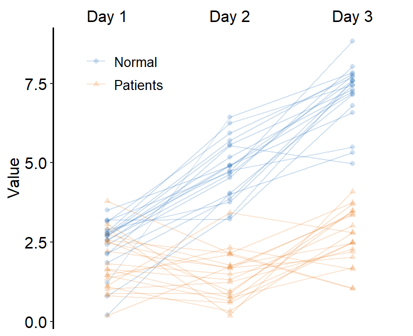
ggplot(data = df3, aes(
  x = Day, y = Value, color = group,
  shape = group, group = group
)) +
  sm_slope(
    labels = c("Day 1", "Day 2", "Day 3"),
    group = Subject,
    point.params = list(alpha = 0.2),
    line.params = list(alpha = 0.2), forget = TRUE
  ) +
  scale_color_manual(values = sm_color("blue", "orange")) +
  scale_shape_manual(values = c(16, 17))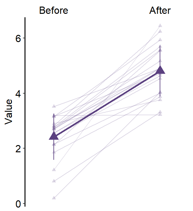
If you want the visualization functions to forget their defaults when
list() is called, set forget = TRUE. This is
necessary when you want to map aesthetics to different variables more
flexibly.
You can also add legends by setting legends = TRUE and put in the upperleft part of the plot.
ggplot(data = df3, aes(
  x = Day, y = Value, color = group,
  shape = group, group = group
)) +
  sm_slope(
    labels = c("Day 1", "Day 2", "Day 3"),
    group = Subject,
    point.params = list(alpha = 0.2),
    line.params = list(alpha = 0.2), forget = TRUE
  ) +
  scale_color_manual(values = sm_color("blue", "orange")) +
  scale_shape_manual(values = c(16, 17)) +
  theme(
    legend.position = c(0.2, 0.85),
    legend.title = element_blank(),
    legend.text = element_text(size = 10)
  )
Next, we can also draw the mean plot for each group by setting show_mean = TRUE.
ggplot(data = df3, aes(
  x = Day, y = Value, color = group,
  shape = group, group = group
)) +
  sm_slope(
    labels = c("Day 1", "Day 2", "Day 3"),
    group = Subject,
    point.params = list(alpha = 0.2),
    line.params = list(alpha = 0.2),
    legends = TRUE, forget = TRUE, show_mean = TRUE
  ) +
  scale_color_manual(values = sm_color("blue", "orange")) +
  scale_shape_manual(values = c(16, 17)) +
  theme(
    legend.position = c(0.2, 0.85),
    legend.title = element_blank(),
    legend.text = element_text(size = 10)
  )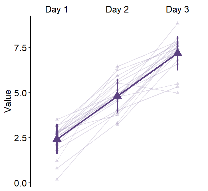
Here, we see that the average line is across all presented data (from Normal and Patients). This is not what we wanted. To resolve this issue, set many_groups = TRUE, which then plots the average line for each group.
ggplot(data = df3, aes(
  x = Day, y = Value, color = group,
  shape = group, group = group
)) +
  sm_slope(
    labels = c("Day 1", "Day 2", "Day 3"),
    group = Subject,
    point.params = list(alpha = 0.2),
    line.params = list(alpha = 0.2),
    legends = TRUE,
    forget = TRUE,
    show_mean = TRUE,
    many_groups = TRUE
  ) +
  scale_color_manual(values = sm_color("blue", "orange")) +
  scale_shape_manual(values = c(16, 17)) +
  theme(
    legend.position = c(0.2, 0.85),
    legend.title = element_blank(),
    legend.text = element_text(size = 10)
  )
This plot can appear quite complicated. The point of this subsection is to show the flexibility of sm_slope(), not necessarily to talk about my preferred practices of data visualization.
5.3 Point plot
In this chapter, we will use a fake data set that I have generated by eyeballing Figure 3 from this paper (PDF):
Yu Mao, Seung Hyun Min, Shijia Chen, Ling Gong, Hao Chen, Robert F. Hess, Jiawei Zhou. Binocular imbalance in amblyopia depends on spatial frequency in binocular combination. IOVS. 2020;61(8):7.
This data set contains both subject groups (Normal and Amblyopia) and conditions (Condition).
We will only use data from the first condition (Condition = 'One') and convert the numerical column SF into categorical column by using the as.factor() function.
df <- read_csv("https://www.smin95.com/amblyopia_random.csv")
df1 <- filter(df, Condition == "One")
df1$SF <- as.factor(df1$SF)
sm_pointplot() groups each observation based on a specific variable, such as Subject or group. Therefore, when sm_pointplot() is used, the grouping always have to be specified like the following: ggplot(aes(x = ..., y = ..., group = xxx)).
We can customise the colors as well in a standard way using sm_color_manual(). The default shape of the point is 16, therefore it has no border.
ggplot(data = df1, aes(
  x = SF, y = absBP,
  color = Group, group = Group
)) +
sm_pointplot() +
scale_color_manual(values = sm_color("darkred", "viridian"))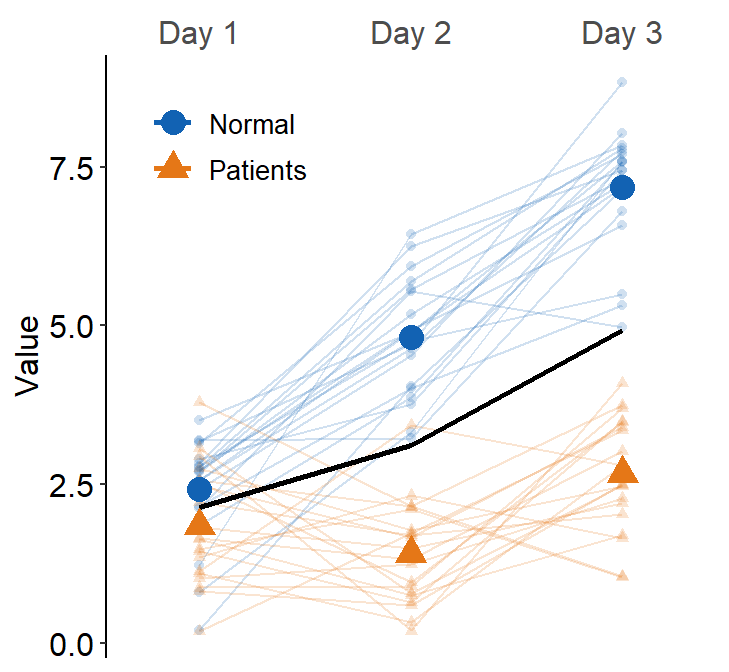
However, we see that the position of the two plots is overlapped! Therefore, we cannot see where the error bar of the darkred plot (Normal) begins and where the viridian plot (Amblyopia) ends.
This is where the generic variable ... in smplot2 comes in handy. You will need to dodge all components of a plot (error bar, point, line) from another plot’s entire components along the x axis. This can be done using the position_dodge() function. Otherwise, you might have to dodge one component by one separately.
The argument position_dodge(width = ...) determines the size of the dodging distance between the plots.
ggplot(data = df1, aes(
  x = SF, y = absBP,
  color = Group, group = Group
)) +
  sm_pointplot(position = position_dodge(width = 0.05)) +
  scale_color_manual(values = sm_color("darkred", "viridian"))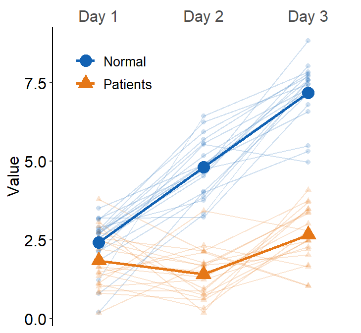
5.3.1 Change the range of y-axis
There are two functions that can be used to change the range of the y-axis: scale_y_continuous() and coord_cartesian().
In most cases, scale_y_continuous() is sufficient. But for sm_pointplot(), use coord_cartesian().
The difference is that, when sm_pointplot() computes the average point from individual observations that are supplied by the data frame, if the y-axis range does not include an individual observation, then the average is computed without the observation when the y-axis range is set with scale_y_continuous(). On the other hand, when coord_cartesian() is used, the average is still computed from all individual observations.
ggplot(data = df1, aes(
  x = SF, y = absBP,
  color = Group, group = Group
)) +
  sm_pointplot(position = position_dodge(width = 0.05)) +
  scale_color_manual(values = sm_color("darkred", "viridian")) +
  coord_cartesian(ylim = c(0, 1.35))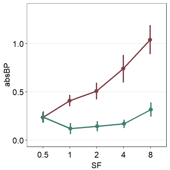
5.3.2 Data with more than two groups
What happens if we have data more than 3 groups? Let’s make a fake dataset using df1.
set.seed(1412)
df1a <- df1 %>% filter(Group == "Amblyopia")
df1a$absBP <- df1a$absBP + abs(rnorm(45, 0, 0.1))
df1a$Group <- "Myopia"
df1a$Subject <- rep(paste0("M", 1:9), 5)

df2 <- rbind(df1, df1a)
set.seed(111)
df1a$absBP <- df1a$absBP + abs(rnorm(45, 0.2, 0.2))
df1a$Group <- "Aniso"
df1a$Subject <- rep(paste0("AN", 1:9), 5)

df2 <- rbind(df2, df1a)
Now we have a data frame df2 that has four groups across five spatial frequencies (SF).
## [1] "Amblyopia" "Normal" "Myopia" "Aniso"Now let’s plot a point plot using sm_pointplot().
ggplot(data = df2, aes(
  x = SF, y = absBP,
  color = Group, group = Group
)) +
  sm_pointplot() +
  scale_color_manual(values = sm_color("darkred", "viridian", "skyblue", "purple"))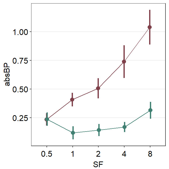
We immediately see that the plots are noticeably overlapped. This becomes an issue if the user attempts to plot repeated-measures data (i.e., each participant measured across time) of multiple groups/condition in a single panel. Fortunately, we can resolve this issue by using position_dodge().
ggplot(data = df2, aes(
  x = SF, y = absBP,
  color = Group, group = Group
)) +
  sm_pointplot(position = position_dodge(width = 0.08)) +
  scale_color_manual(values = sm_color("darkred", "viridian", "skyblue", "purple"))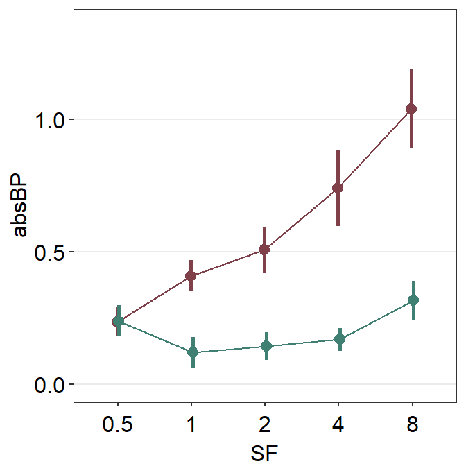
By using the function position_dodge(), we can see each plot quite clearly.
Following is the equivalent code but it only nudges the error bar because it does not take advantage of using a generic parameter ... to control the aesthetics. Instead it uses err.params = list(position = position_dodge(width = ...)). So, the points are still overlapped.
ggplot(data = df2, aes(
  x = SF, y = absBP,
  color = Group, group = Group
)) +
  sm_pointplot(err.params = list(position = position_dodge(width = 0.08))) +
  scale_color_manual(values = sm_color("darkred", "viridian", "skyblue", "purple"))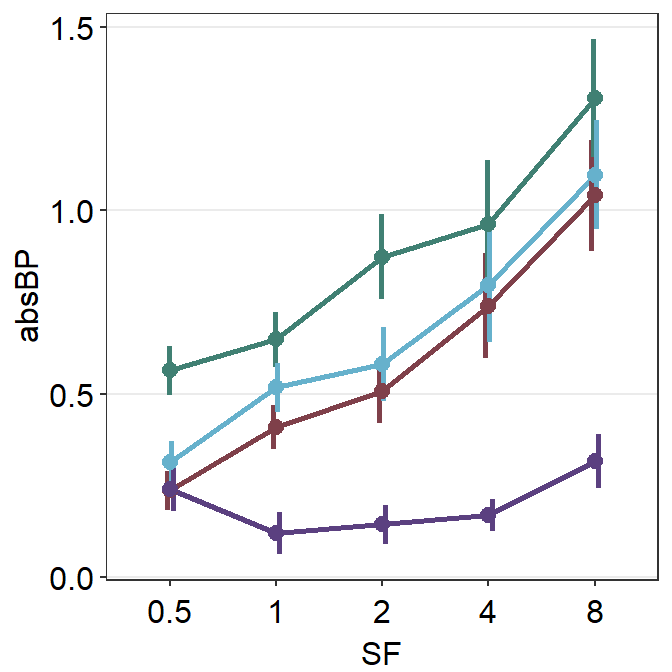
Notice that only the error bars have shifted, not the lines and points. We can nudge all components of the plot using xxx.params. These are:
err.paramsfeeds arguments togeom_linerange()to plot the error bar with specifiedcolor,sizeetc.avgPoint.paramsfeeds arguments togeom_point()to plot the average point with specifiedcolor,fill,size,shapeandalpha.avgLine.paramsfeeds arguments togeom_line()to plot the average line with specifiedcolor,sizeandalpha.point.paramsfeeds arguments togeom_point()to plot the points in the shadow with specifiedcolor,fill,size,shapeandalpha.line.paramsfeeds arguments togeom_line()to plot the lines in the shadow with specifiedcolor,sizeandalpha.
Notice that these components are also found in sm_slope().
ggplot(data = df2, aes(
  x = SF, y = absBP,
  color = Group, group = Group
)) +
  sm_pointplot(
    err.params = list(position = position_dodge(width = 0.08)),
    avgPoint.params = list(position = position_dodge(width = 0.08)),
    avgLine.params = list(position = position_dodge(width = 0.08))
  ) +
  scale_color_manual(values = sm_color("darkred", "viridian", "skyblue", "purple"))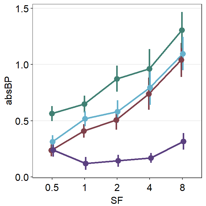
Now that we know how convenient it is to use the generic parameter ... to shift the plot’s position, lets use it to position_dodge and change the size of all components of the plots. Therefore, we will use size as a generic argument (sm_pointplot(size = ...,)).
ggplot(data = df2, aes(
  x = SF, y = absBP,
  color = Group, group = Group
)) +
  sm_pointplot(size = 1, position = position_dodge(width = 0.1)) +
  scale_color_manual(values = sm_color("darkred", "viridian", "skyblue", "purple"))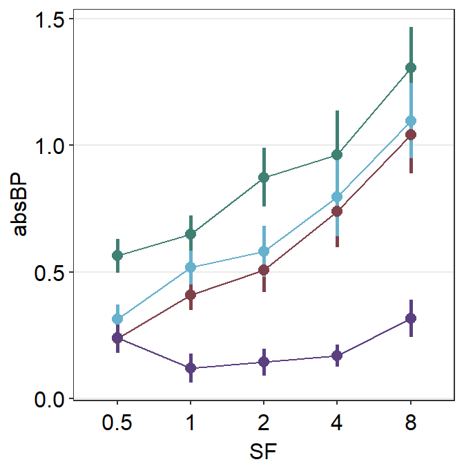
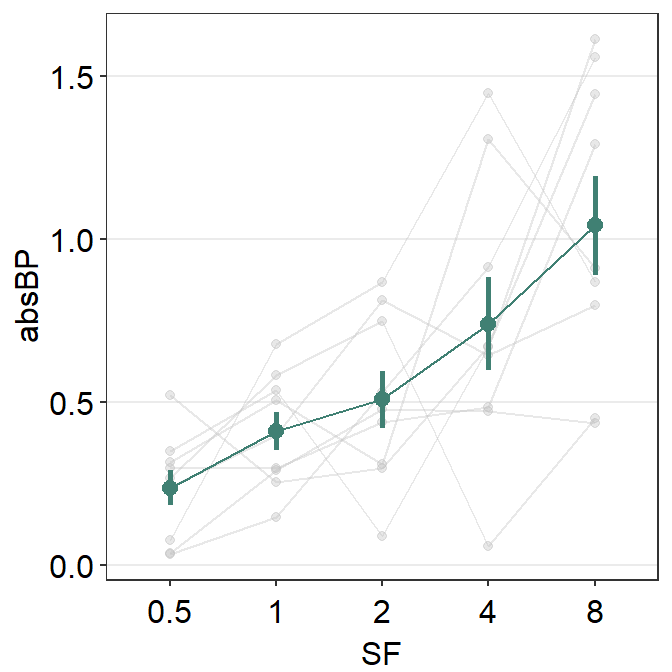
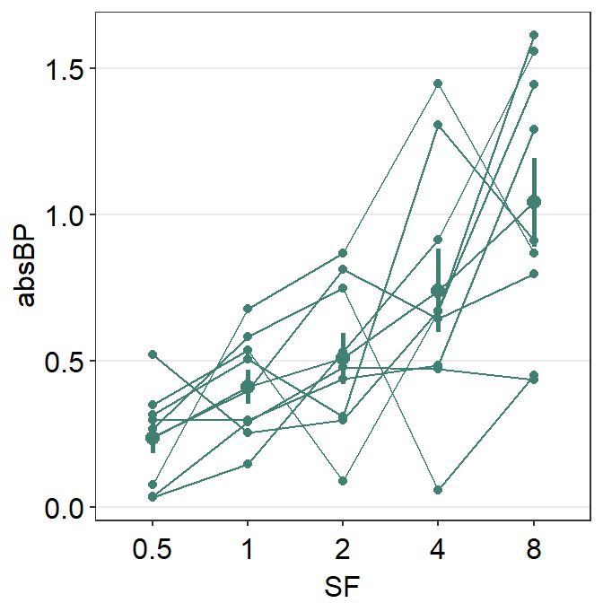
5.3.3 Point plot with a shadow using data of one group
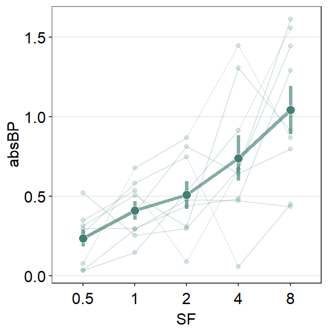
Now let’s say you would like to plot the mean data of one group (amblyopia) as well as individual plots behind the mean plot as a dim shadow by setting sm_pointplot(..., show_shadow = T).
Let’s use the same dataset and filter for observations from Condition = 'One' and Group = 'Amblyopia'.
When you decide to show shadow using sm_pointplot(), you need to specify group argument in sm_pointplot() in this format: sm_pointplot(group = xxx), where xxx is the name of the variable that includes identifiers for each observation.
In the shadow, each individual point has to be plotted, and the points have to be connected to form a line. This line has to be connected for each Subject in our example, therefore it should be set as sm_pointplot(group = Subject, ...).
Therefore, notice that there are two group arguments in this case. The first one is for the average plot in aes() in this format: ggplot(data, aes(x = ..., y =..., group = yyy)), where yyy is the name of the variable that includes identifiers for condition/group of all observers from which the average can be computed. The second group is within sm_pointplot() in this format: sm_pointplot(group = xxx), where xxx represents the name of the variable for individual identifiers.
ggplot(df2a, aes(
  x = SF, y = absBP, color = Group,
  group = Group
)) + # grouped for average
  sm_pointplot(
    group = Subject, ## grouped for shadow
    avgPoint.params = list(size = 2.5),
    show_shadow = T
  ) +
  scale_color_manual(values = sm_color("viridian"))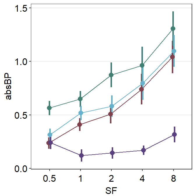
You can finely control the aesthetics of the shadow by using line.params = list() and point.params = list(). The appearance of the average points and lines are controlled with avgLine.params and avgPoint.params.
ggplot(df2a, aes(x = SF, y = absBP, color = Group, group = Group)) +
  sm_pointplot(
    group = Subject,
    avgPoint.params = list(
      fill = sm_color("viridian"),
      shape = 21, color = "white"
    ),
    avgLine.params = list(size = 1.3, alpha = 0.65),
    err.params = list(size = 1.3, alpha = 0.65),
    show_shadow = T
  ) +
  scale_color_manual(values = sm_color("viridian"))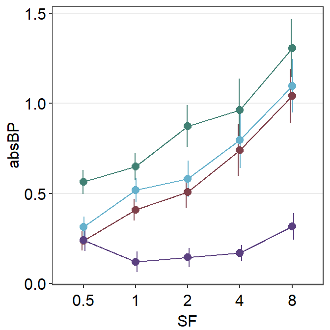
Now it looks a lot better!
5.3.4 Point plot with a shadow using data of multiple groups
Now’ lets filter data from two groups Amblyopia and Normal. We can do so by using |, which means OR. & means AND.
df2b <- filter(df2, Group == "Amblyopia" | Group == "Normal")
df2b$SF <- as.factor(df2b$SF)
unique(df2b$Group)
## [1] "Amblyopia" "Normal"After confirming that we have successfully filtered the data, we can plot the data of the two groups with a shadow for each group. The default color of the shadow is gray, and this needs to be forgotten by setting forget = TRUE so that we can assign unique shadow color to each group. The alpha level is set to 0.1 for the lines and points of the shadow.
ggplot(df2b, aes(
  x = SF, y = absBP,
  color = Group, group = Group
)) +
  sm_pointplot(
    group = Subject, show_shadow = T,
    size = 1,
    position = position_dodge(width = 0.08),
    line.params = list(alpha = 0.1, size = 0.6),
    point.params = list(alpha = 0.1, size = 0.6),
    forget = TRUE
  ) +
  scale_color_manual(values = sm_color("darkred", "viridian"))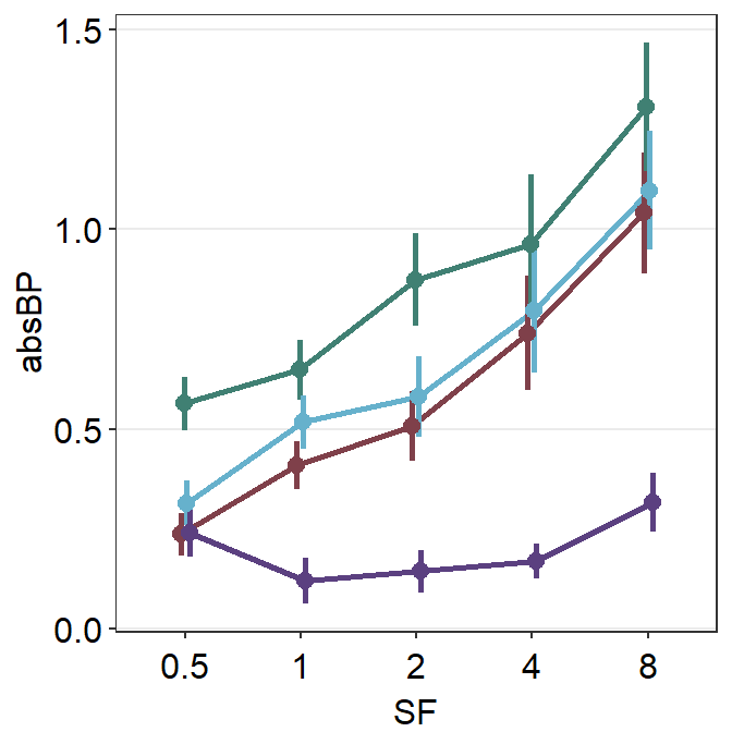
This is a point plot that includes everything we have learned thus far, such as position_dodge(), the importance of generic paramter ..., inclusion of a shadow show_shadow = T, and using two group arguments (one for the average plot, one for the individual points for the shadow).
5.3.5 Adding and modifying legends
You can also add legend to label the two colors by setting sm_pointplot(..., legends = TRUE)
ggplot(df2b, aes(
  x = SF, y = absBP,
  color = Group, group = Group
)) +
  sm_pointplot(
    group = Subject, show_shadow = T,
    size = 1,
    position = position_dodge(width = 0.08),
    line.params = list(alpha = 0.1, size = 0.6),
    point.params = list(alpha = 0.1, size = 0.6),
    legends = TRUE,
    forget = TRUE
  ) +
  scale_color_manual(values = sm_color("darkred", "viridian"))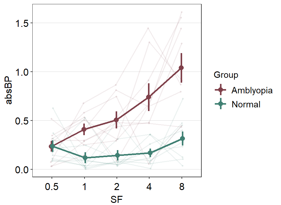
We can move the legend to the topleft part of the plot that has most empty space using theme(legend.position = ...). Also, the title of the legend can be removed with theme(legend.title = element_blank)
ggplot(df2b, aes(
  x = SF, y = absBP,
  color = Group, group = Group
)) +
  sm_pointplot(
    group = Subject, show_shadow = T,
    size = 1,
    position = position_dodge(width = 0.08),
    line.params = list(alpha = 0.1, size = 0.6),
    point.params = list(alpha = 0.1, size = 0.6),
    legends = TRUE,
    forget = TRUE
  ) +
  scale_color_manual(values = sm_color("darkred", "viridian")) +
  theme(
    legend.position = c(0.24, 0.80), # position the legend's location
    legend.title = element_blank()
  )
Note that the legend includes horizontal and vertical lines around the plot. The vertical line represents the error bar, and the horizontal line represents the line that connects between the points at various x levels. The symbols in legend can be manually modified. In this case, I will remove the vertical error bar from the legend by writing err.params = list(show.legend = FALSE).
ggplot(df2b, aes(
  x = SF, y = absBP,
  color = Group, group = Group
)) +
  sm_pointplot(
    group = Subject, show_shadow = T,
    size = 1,
    position = position_dodge(width = 0.08),
    line.params = list(alpha = 0.1, size = 0.6),
    point.params = list(alpha = 0.1, size = 0.6),
    err.params = list(show.legend = FALSE),
    legends = TRUE,
    forget = TRUE
  ) +
  scale_color_manual(values = sm_color("darkred", "viridian")) +
  theme(
    legend.position = c(0.24, 0.80),
    legend.title = element_blank()
  )
You can also think about controlling the ratio of the figure when saving the figure. In this example, base_height and base_width are specifically controlled.
ggplot(df2b, aes(
  x = SF, y = absBP,
  color = Group, group = Group
)) +
  sm_pointplot(
    group = Subject, show_shadow = T,
    size = 1,
    position = position_dodge(width = 0.08),
    line.params = list(alpha = 0.1, size = 0.6),
    point.params = list(alpha = 0.1, size = 0.6),
    err.params = list(show.legend = FALSE),
    legends = TRUE,
    forget = TRUE
  ) +
  scale_color_manual(values = sm_color("darkred", "viridian")) +
  theme(
    legend.position = c(0.24, 0.80),
    legend.title = element_blank()
  ) -> pointplot

print(pointplot)